Mt. Baker Craftsman

This craftsman update is an ongoing project. The kitchen, dining room, and primary bedroom updates are substantially complete, with a bathroom and guest suite redesign in progress. The design goal for this home is to enhance the craftsman details of the architecture while accommodating more contemporary furnishings.
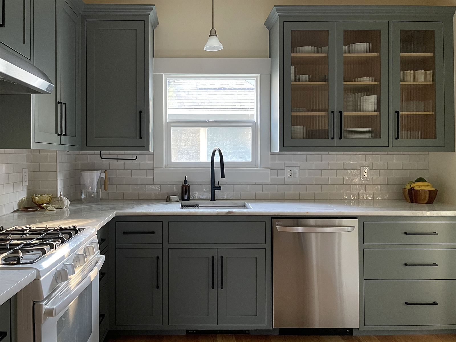
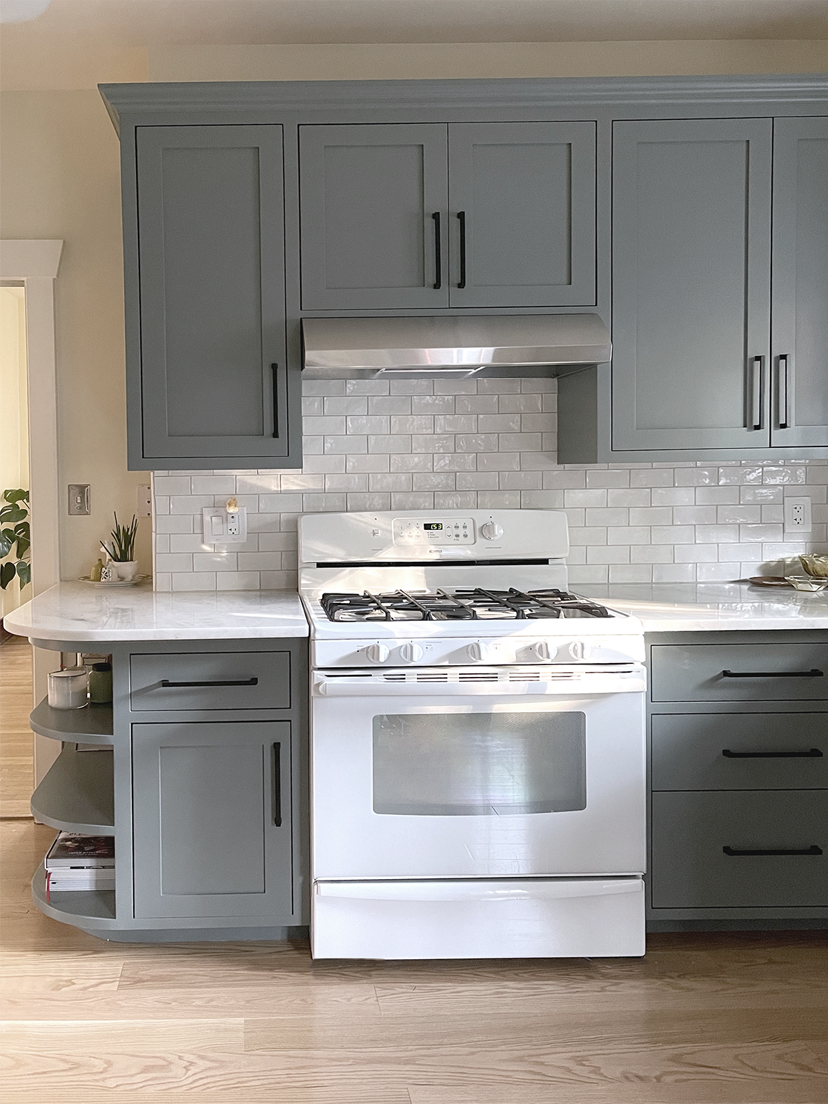
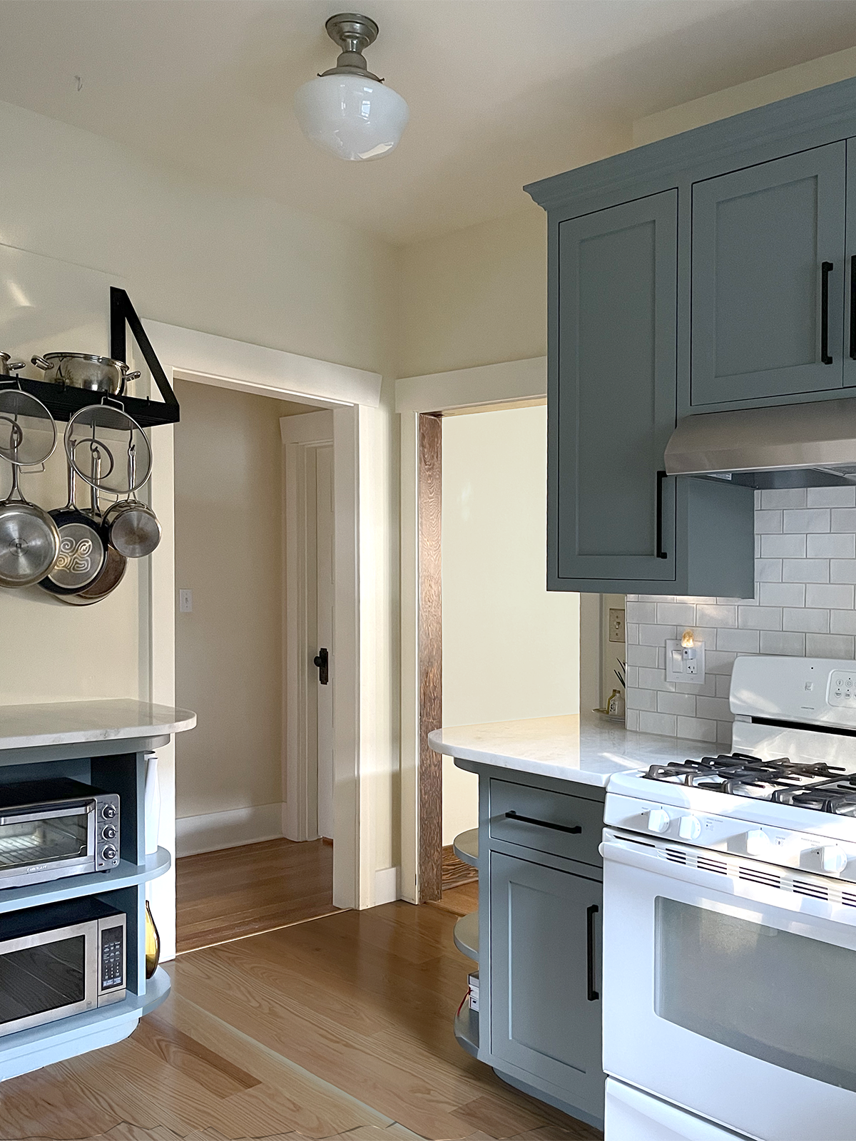
In the kitchen the existing cabinet layout was successful enough to keep, but the color scheme of creamsicle orange, aubergine and silly-putty pink needed a refresh. The cabinets were painted, and a new open shelfing unit was added next the refrigerator. Light quartzite counters and an organic white tile balance out the darker cabinet color, and hardwood floors connect the room to the rest of the house. An updated slide-in range is on its way!
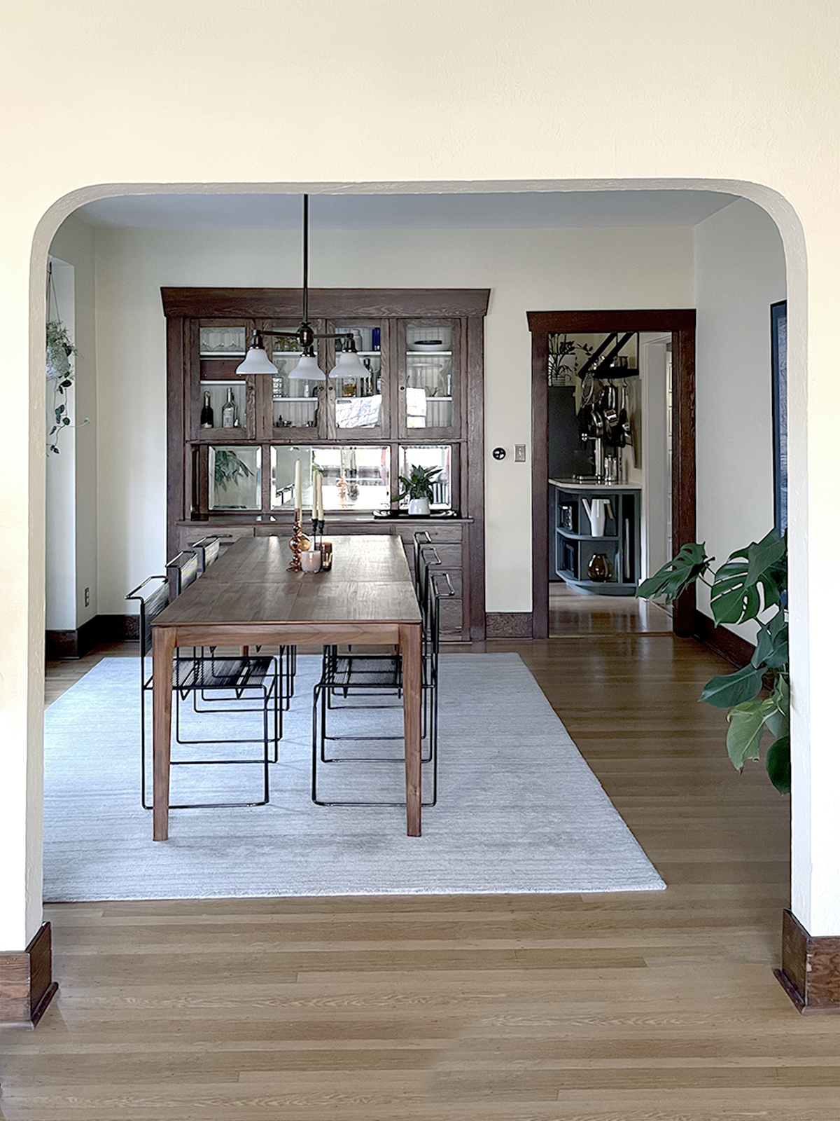
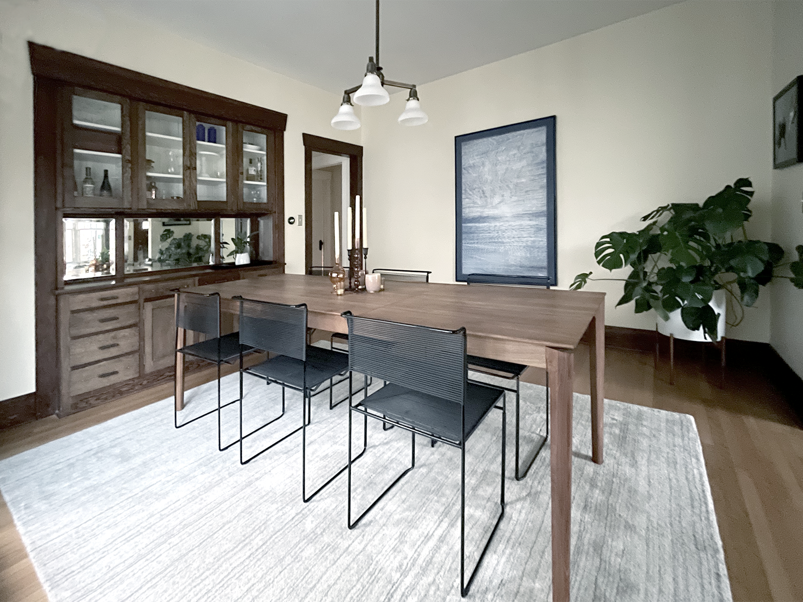
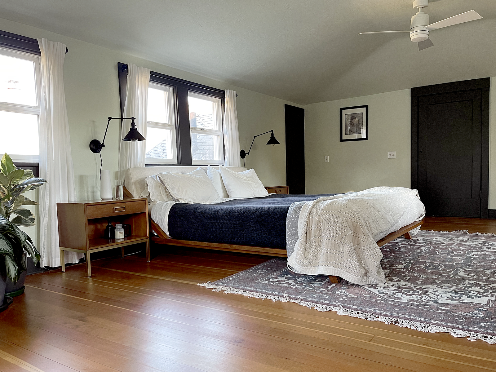
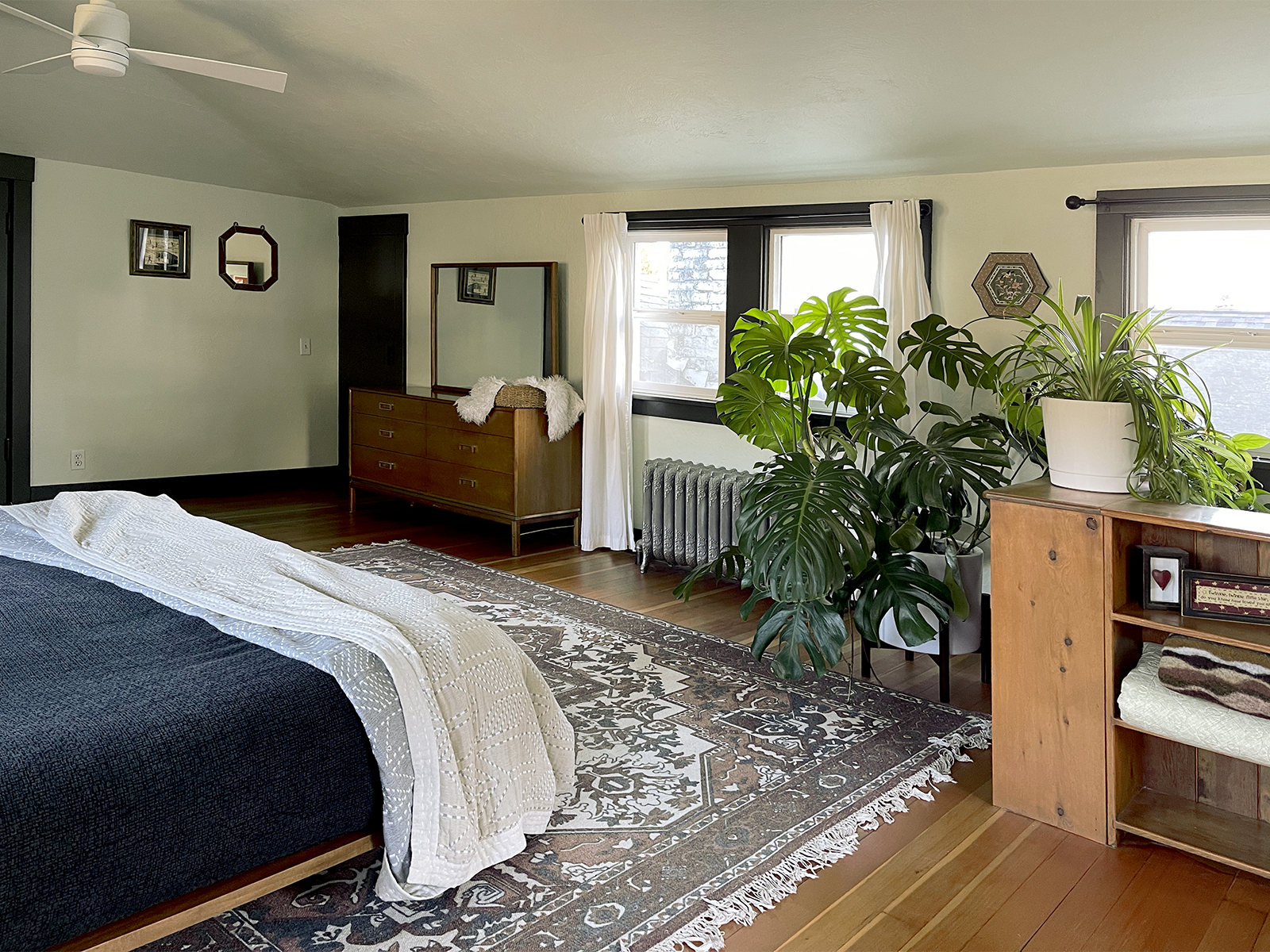
The dining room and primary bedroom also got color refreshes. Vintage finds like Spaghetti Chairs by Giandomenico Belotti and a mid-century teak bedroom set are combined with new pieces for a look that is eclectic, yet balanced. Using only functional and necessary furniture pieces allows visual space for bold curtains and rugs.
Tuscon Starter Home
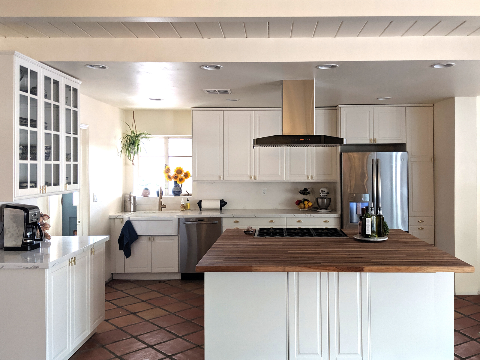
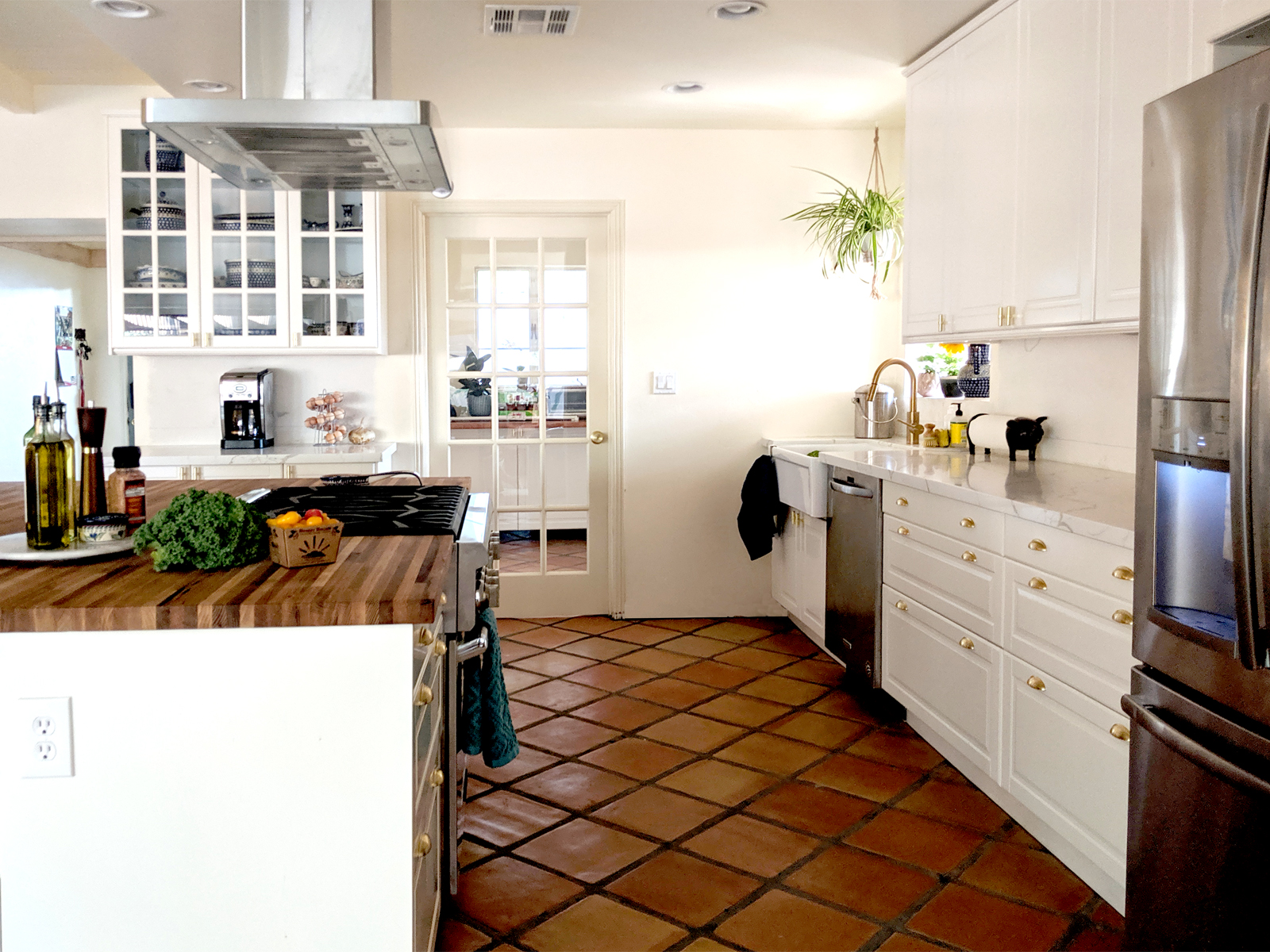
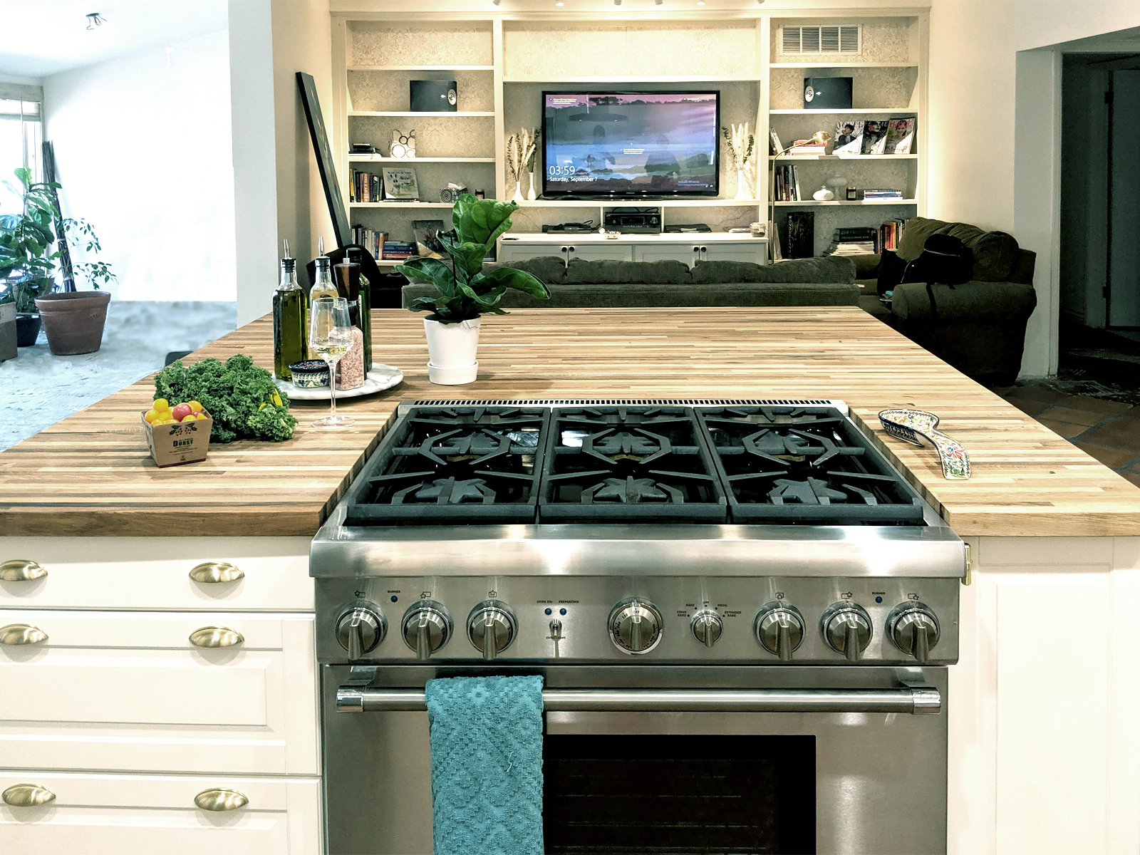

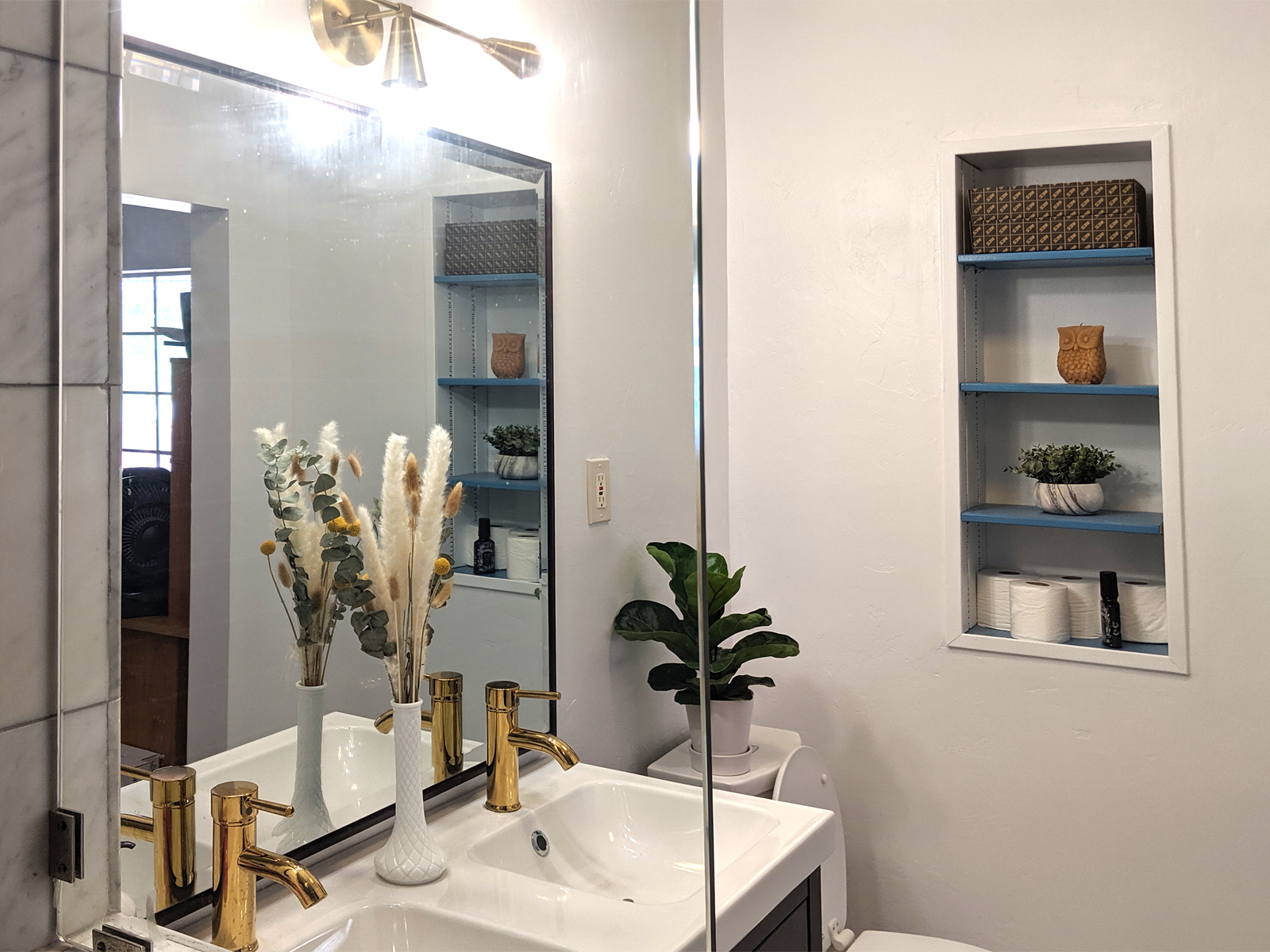
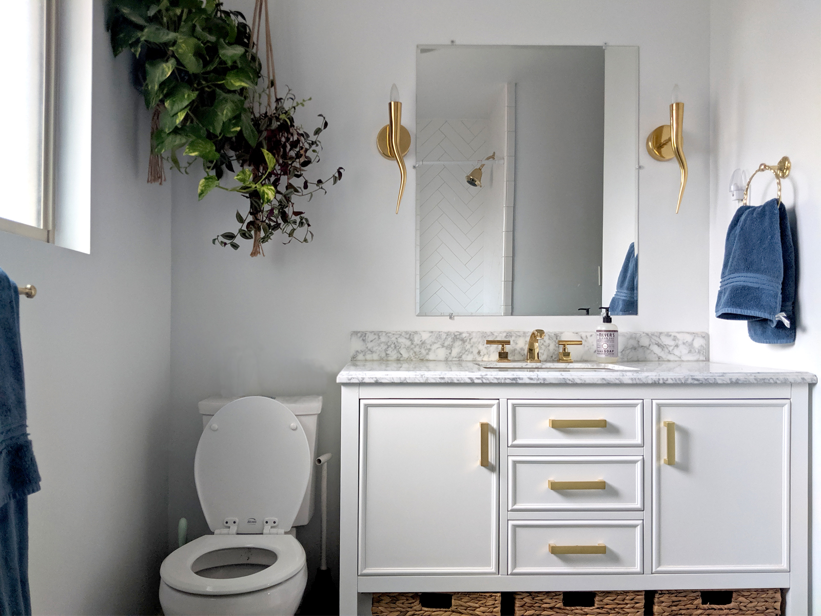
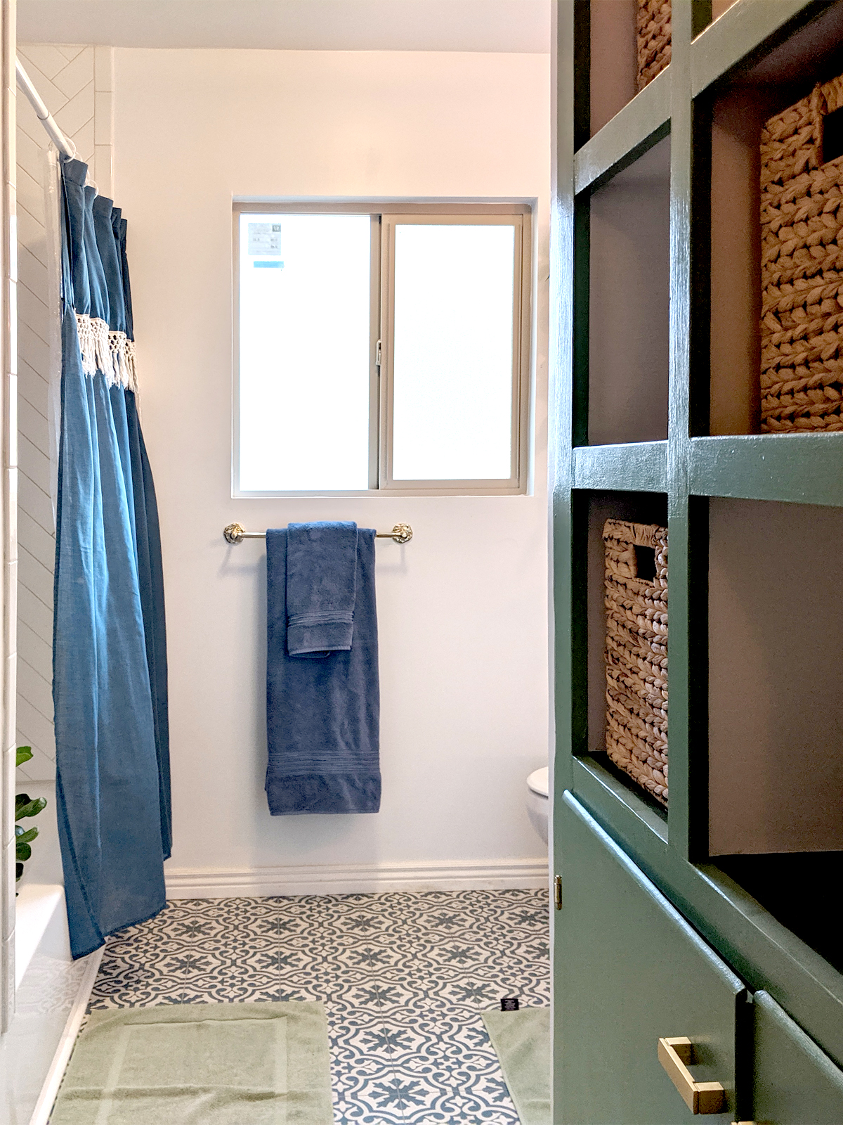
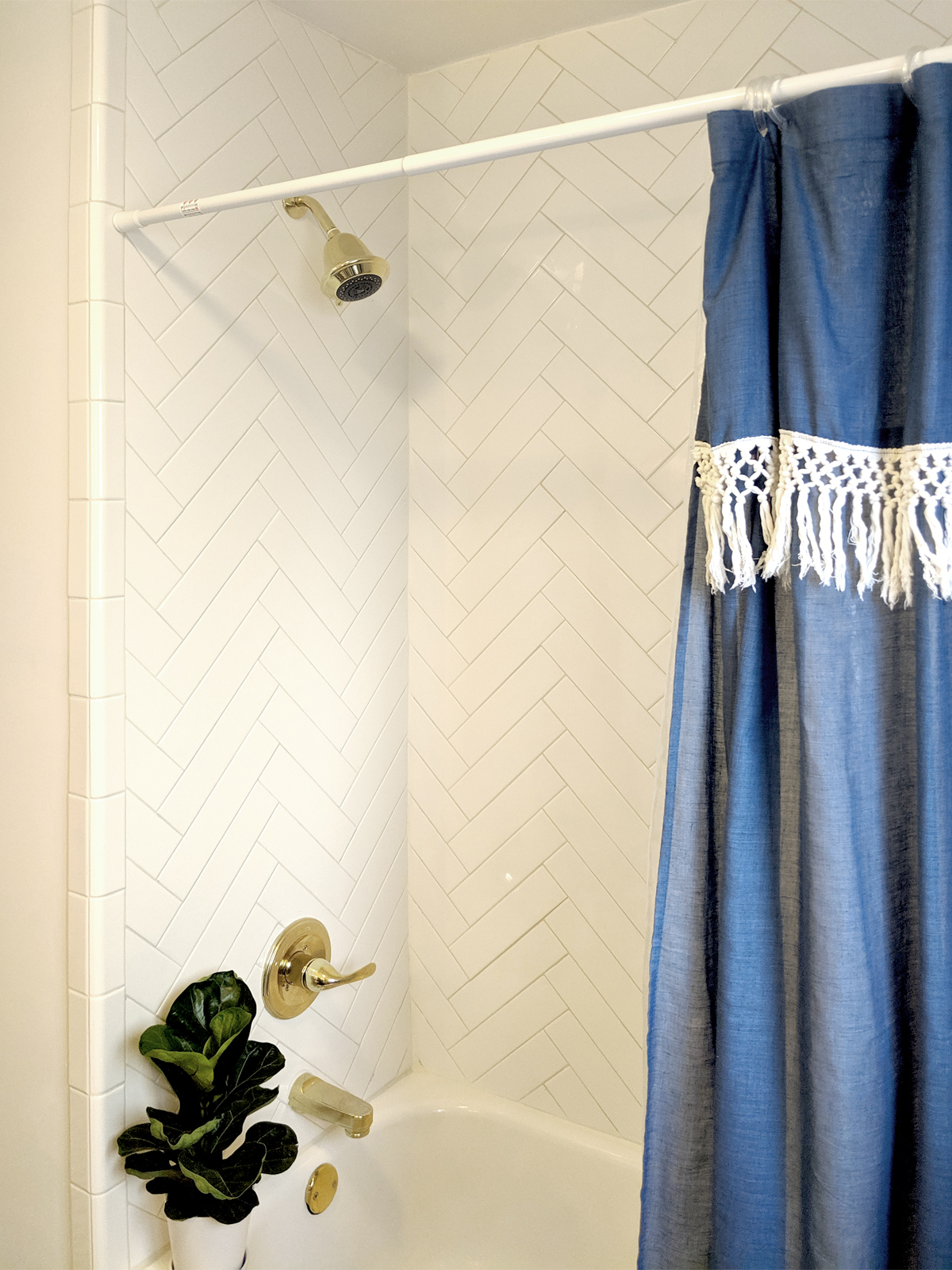
This modest southwestern ranch house had its original 1960’s bathroom and two separate but equally dated kitchens. The homeowners wanted a modern bohemian vibe with open spaces for entertaining, but did not want to jeopardize resale value. With a $55,000 budget, the priorities were to update both bathrooms, open up the main living spaces, create a large open kitchen and make sure both people had comfortable spaces to work from home. To save money, the design includes an Ikea kitchen while splurging on the homeowner’s passion for interesting tile. This project is still under construction, professional photos coming soon!
Furniture Showroom
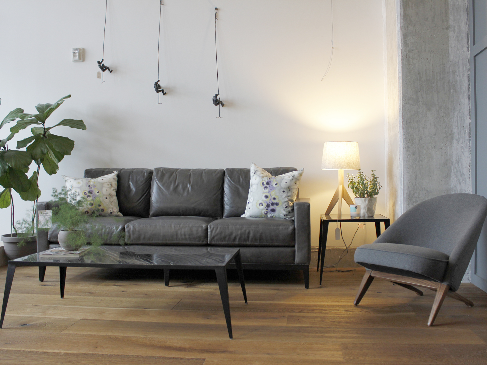

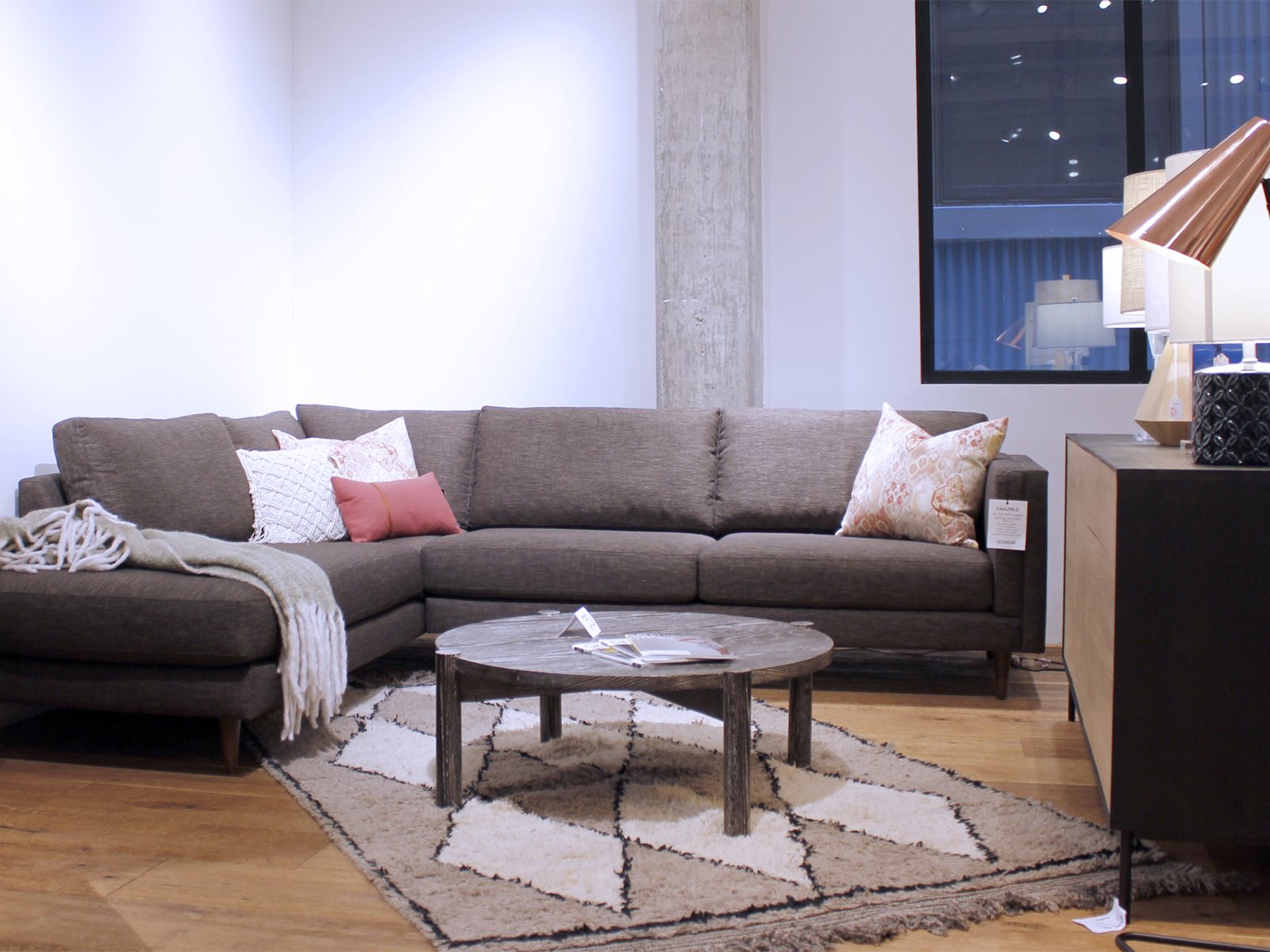
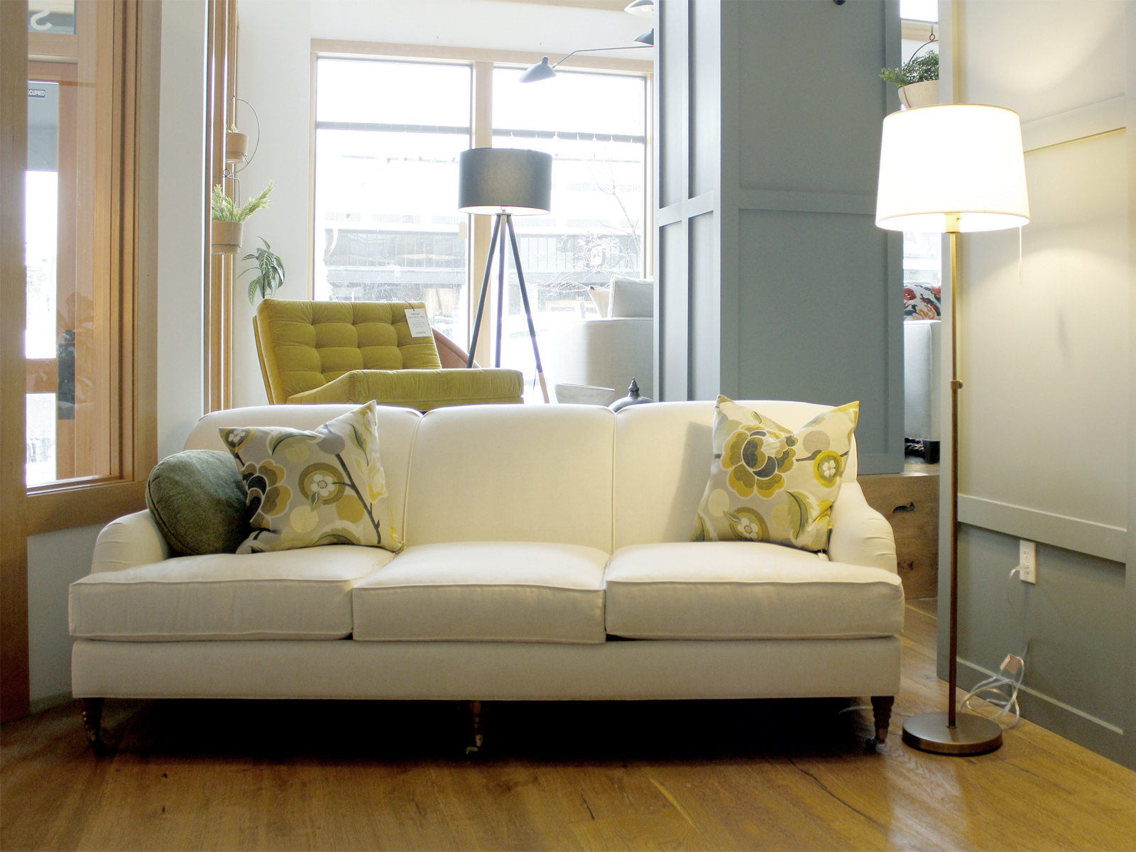

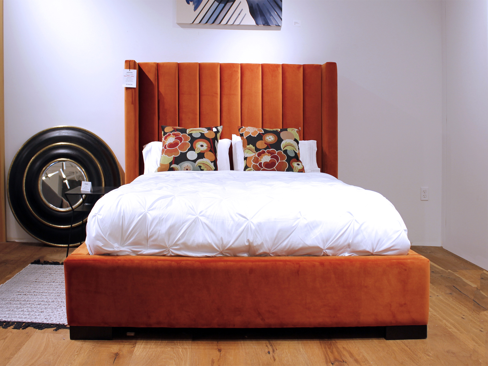

Location was the priority for Couch Seattle’s move to a 3000 square foot storefront on Ballard Ave. As a result of low inventory of storefronts, the business ended up in a deep, narrow space with limited window frontage and several poorly placed columns and exposed pipes. The design needed to soften a sterile new construction building, be neutral enough to showcase both modern and traditional furniture, and provide a good backdrop for product photography.
Capitol Hill Apartment
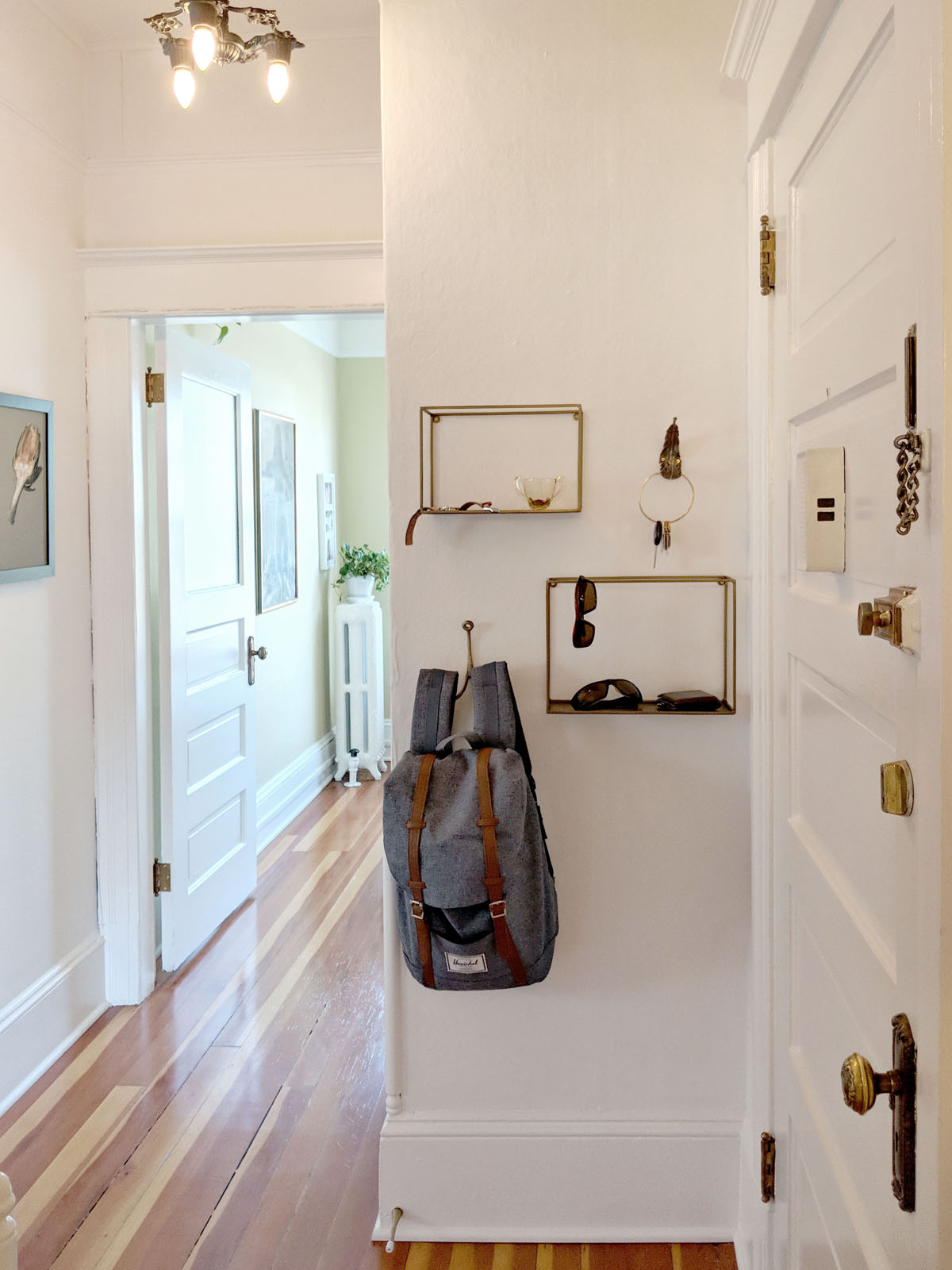
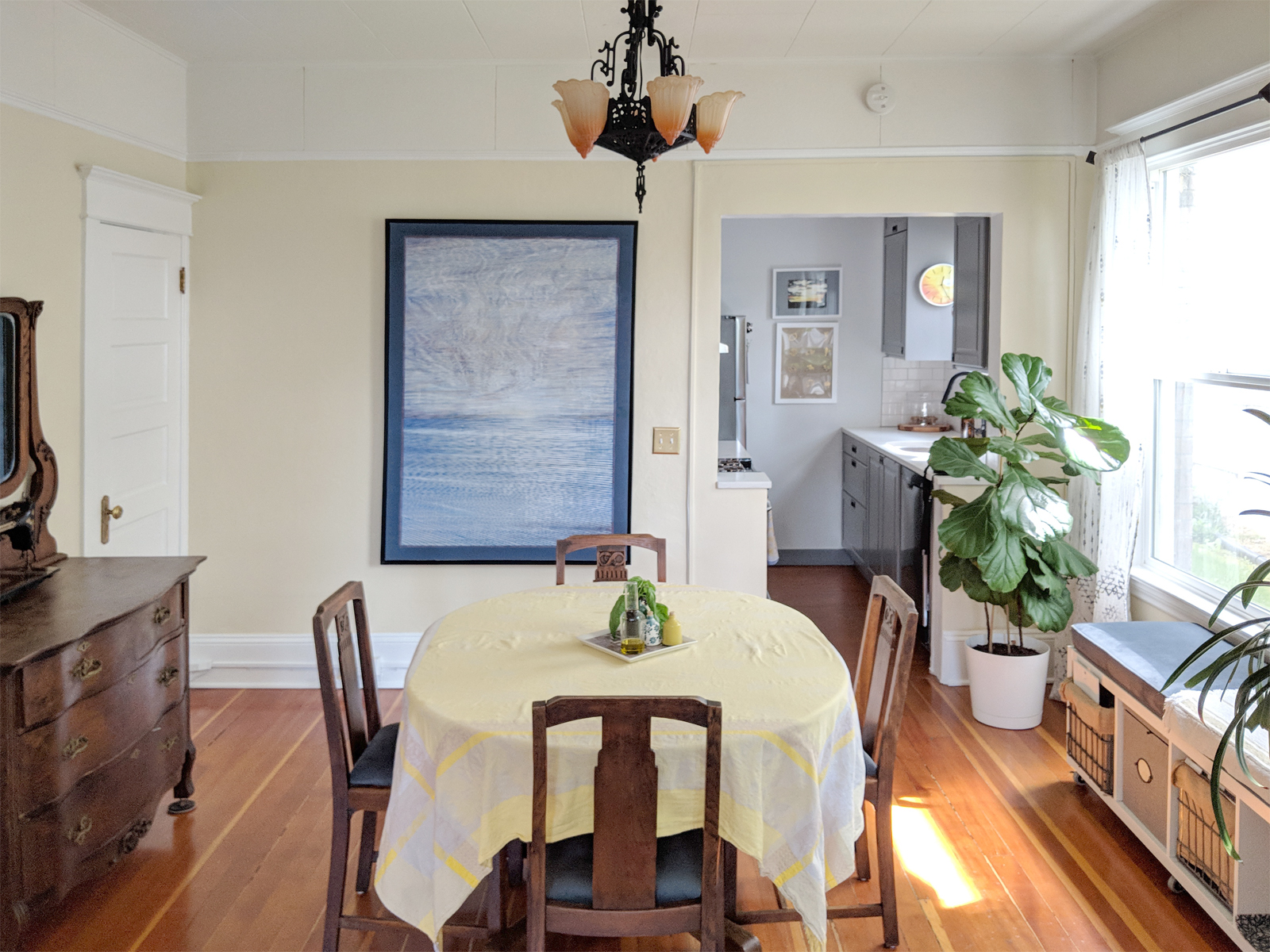
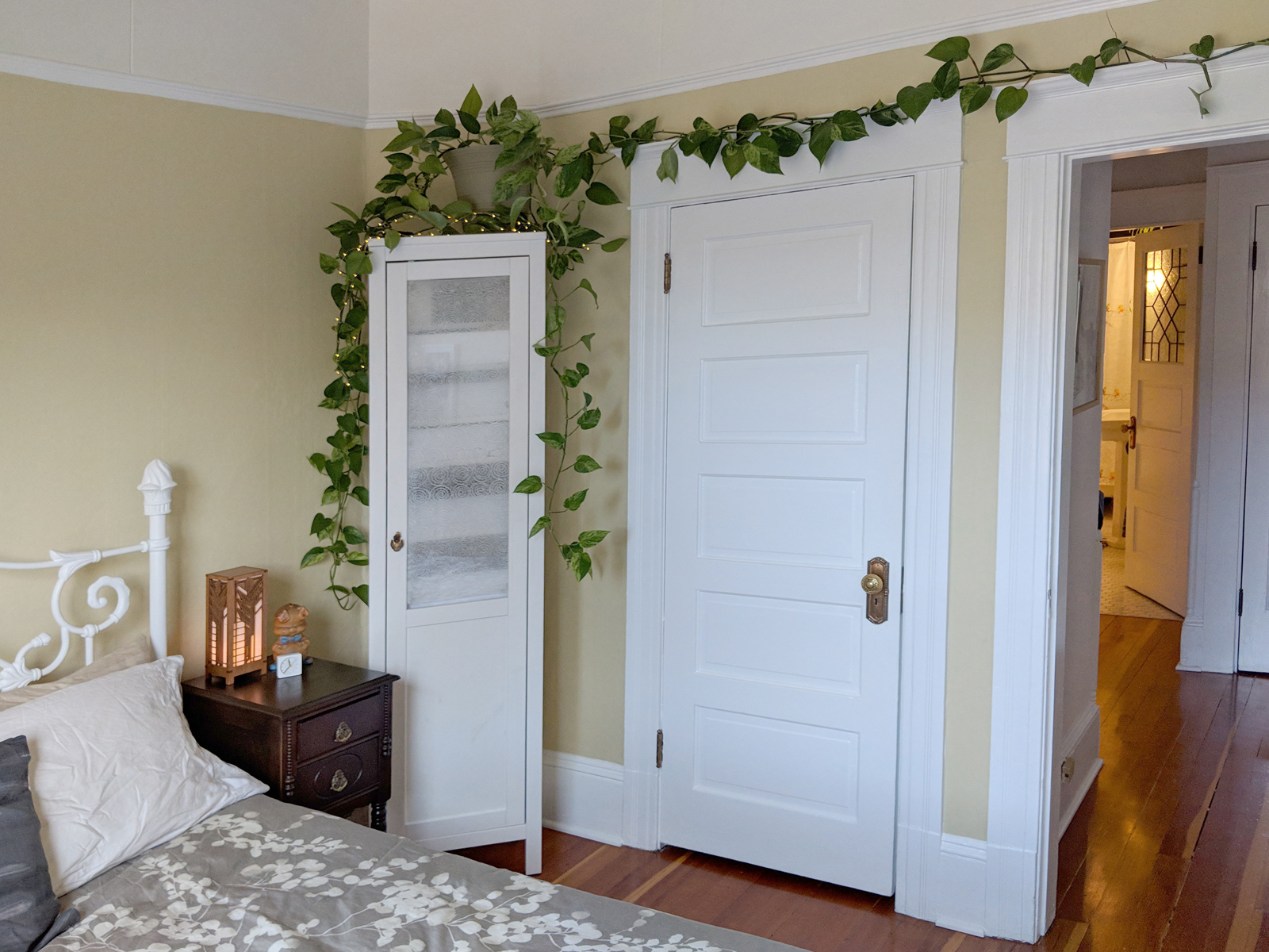
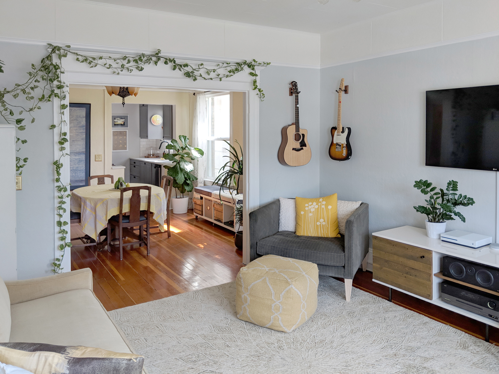

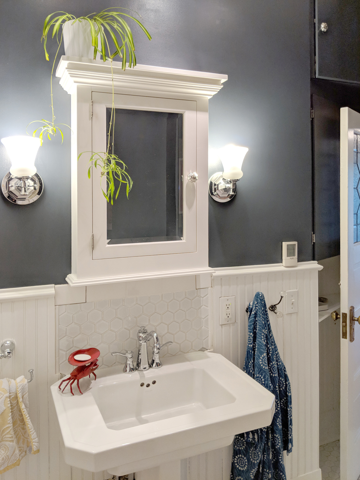
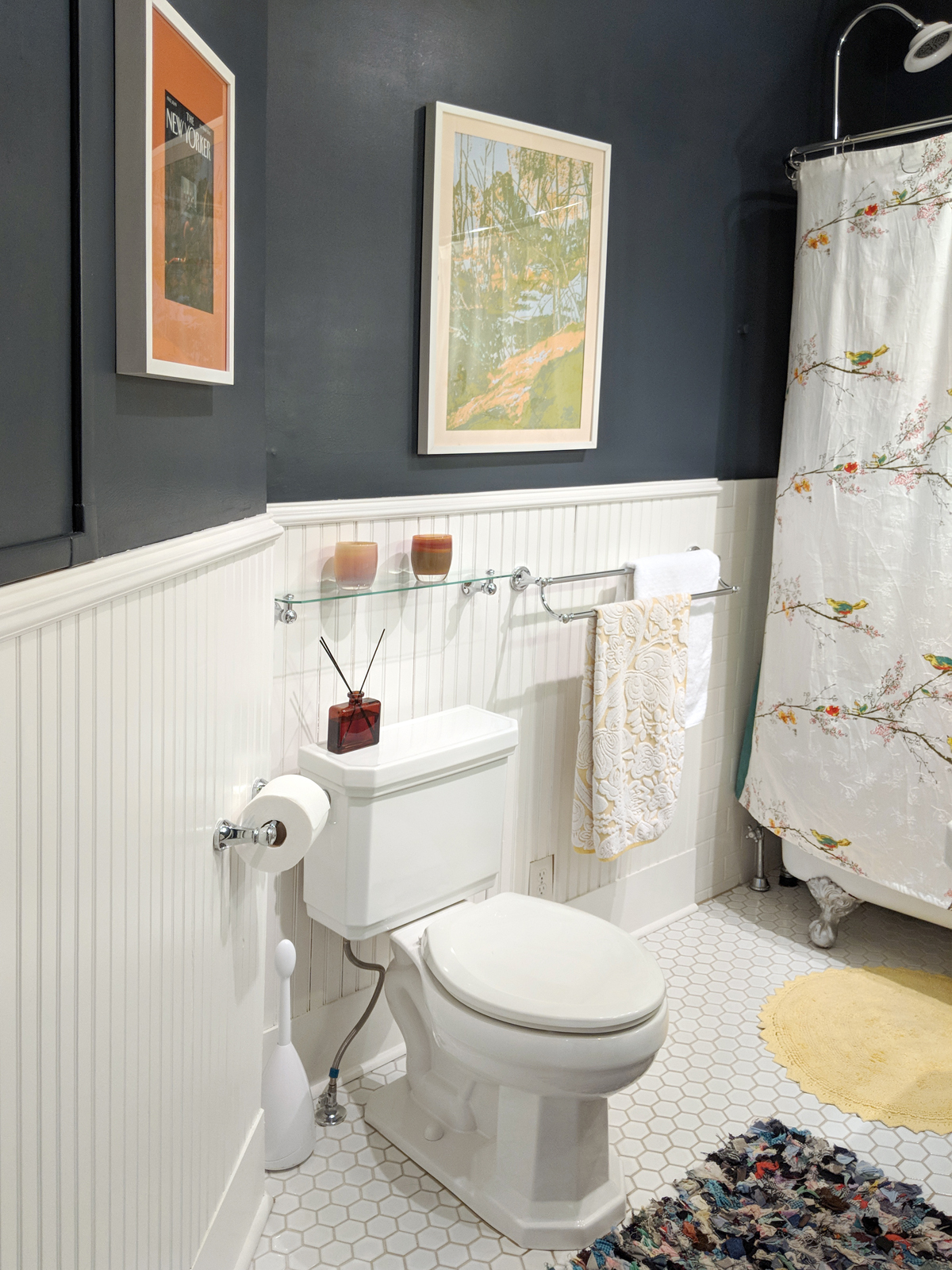
This Capitol Hill condo has much of its original detail, but was used as a rental for many years and was a victim of a rough DIY kitchen update. The goal of the project is an update that harmonized with the turn-of-the-century details, while not looking like a time capsule. Improvements included fresh paint for the walls, trim, and radiators; stripping the original brass hardware, and replacing louvered closet doors with a mirrored panel door. New window treatments and vintage Lincoln lights painted matte black round out the look.
The furniture mixes family heirlooms with minimalist white pieces to avoid visual clutter. Incorporating hidden storage lightened the space and helped compensate for tiny closets. The layout balances an open feeling with the need for storage and a growing plant collection.
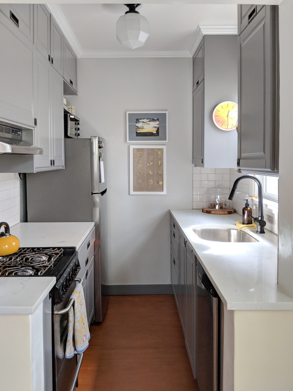
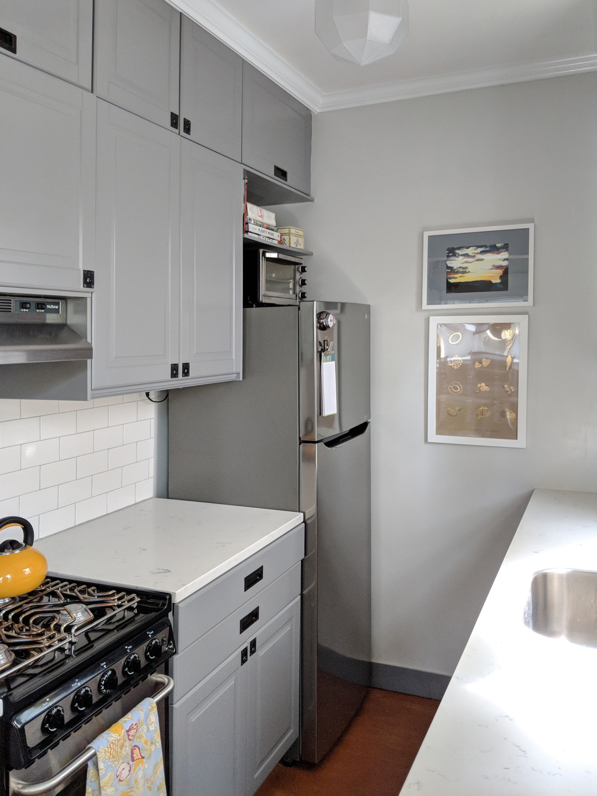
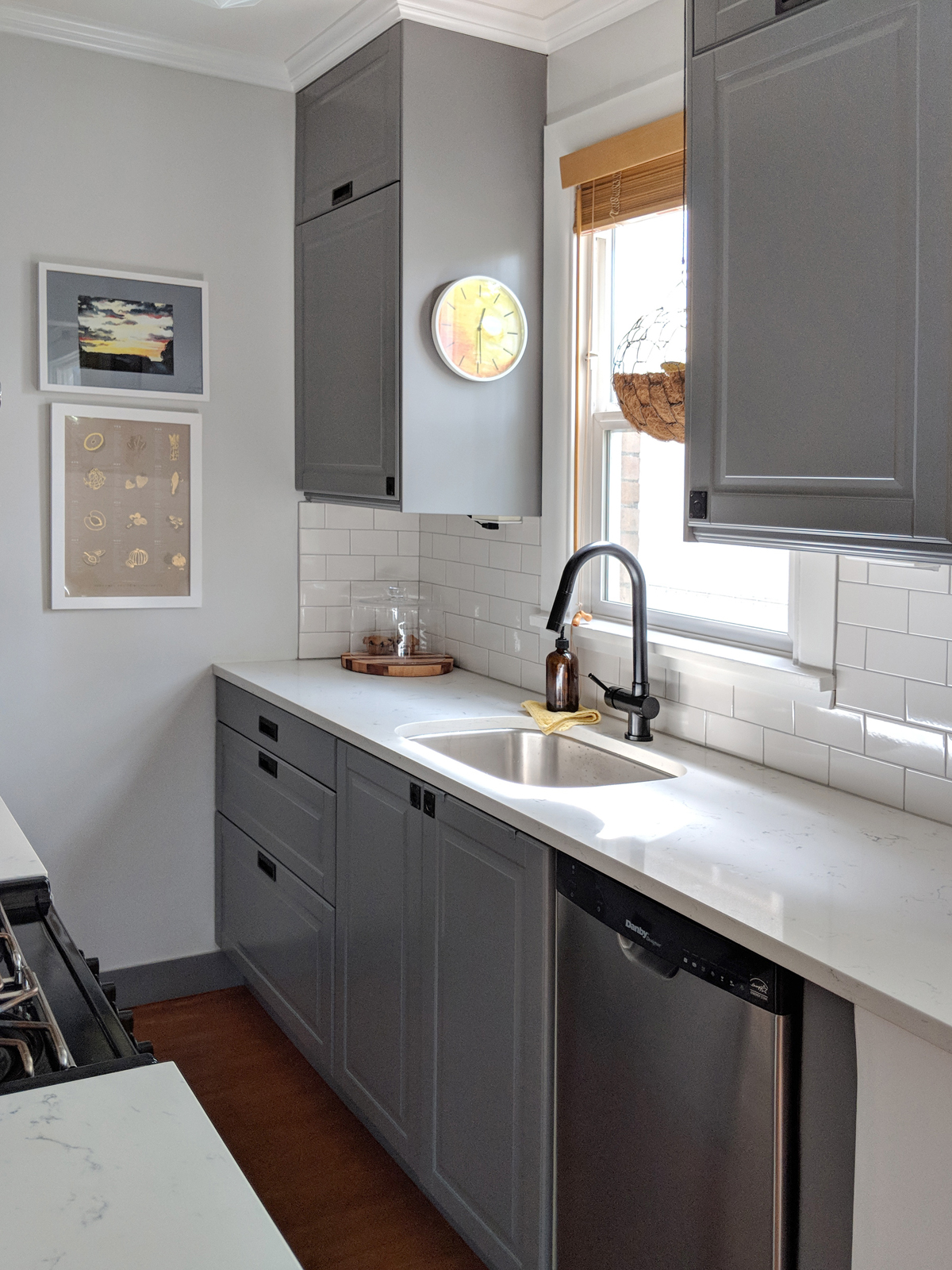
The tiny 6’x 7’ kitchen was the most extensive project. It had been designed in an earlier era with a countertop ice box, and the layout did not have room for a refrigerator. The sink was not under the window, which wasted valuable upper cabinet space. A narrow doorway closed the kitchen off from the more spacious dining room.
Widening the doorway to be flush with the upper cabinets and a galley-style layout makes the most of the minimal space. Cutting the countertop back to be only ¼” proud of the lower cabinets, and using inset door pulls designed for boat, maximizes floor space. Moving the sink under the window, running the upper cabinets to the ceiling, installing apartment-sized appliances, and using drawer units for the lower cabinets provides maximum storage.