Branding


A black, white and grey color scheme allows the photos of Seattle furniture store Couch products to take center stage. The logo is meant to be evocative of the outline of a couch or bench. The invoice design prioritizes clarity and eliminates client confusion over which specs were selected. Cut sheets attempt to strike a balance between giving a range of options in a systematized way and being prescriptive about what is possible.
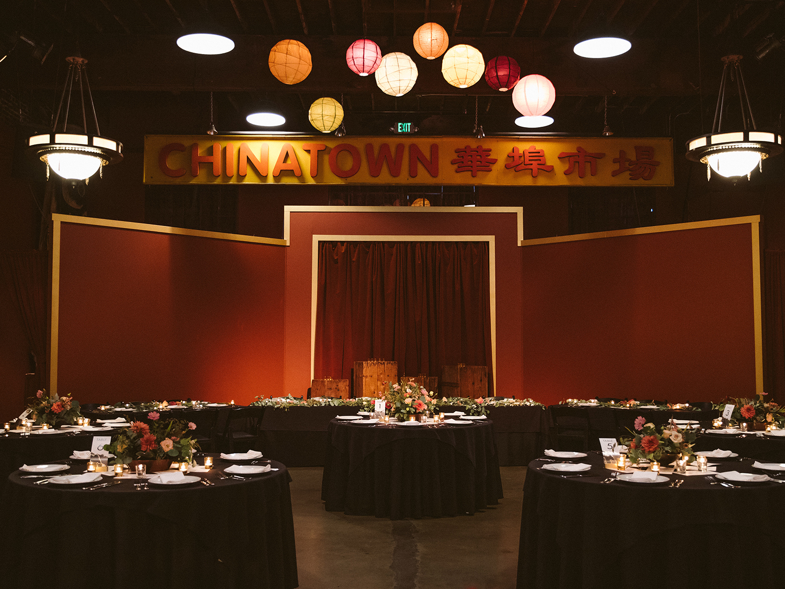
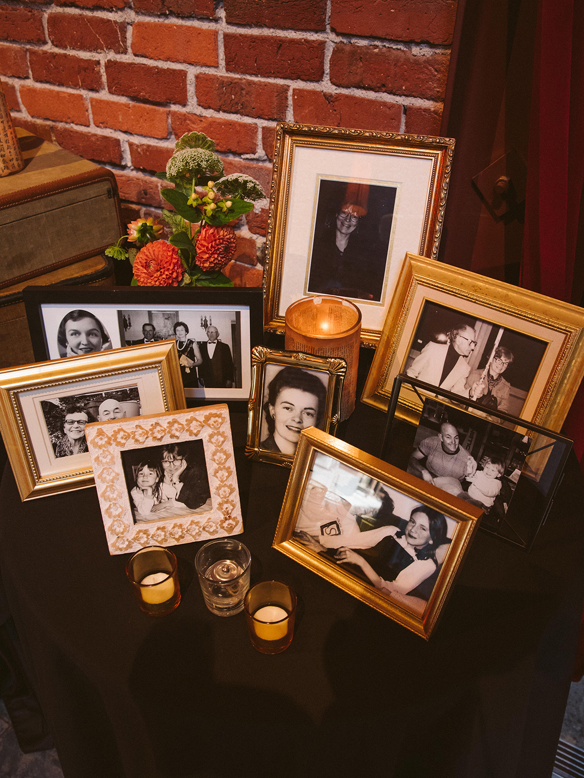
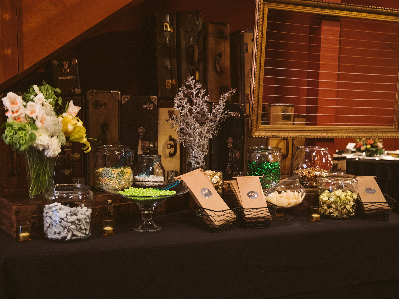
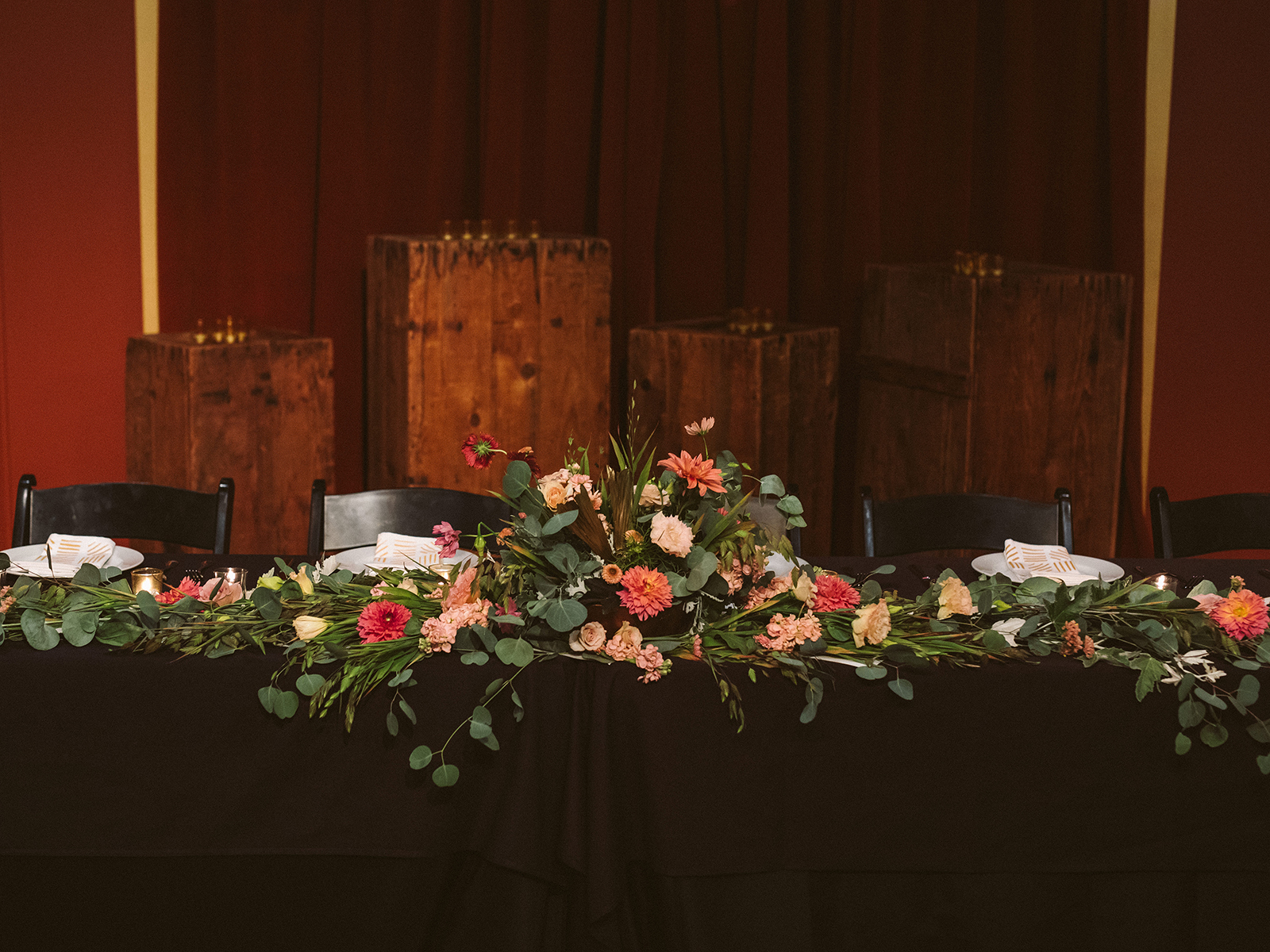
Georgetown Wedding
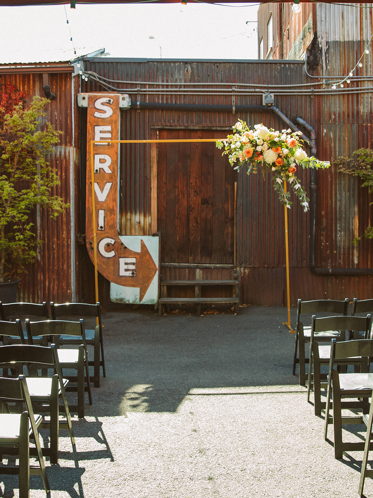
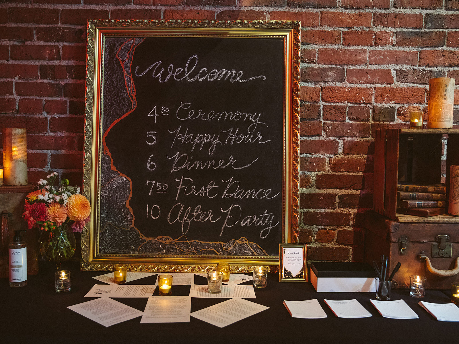
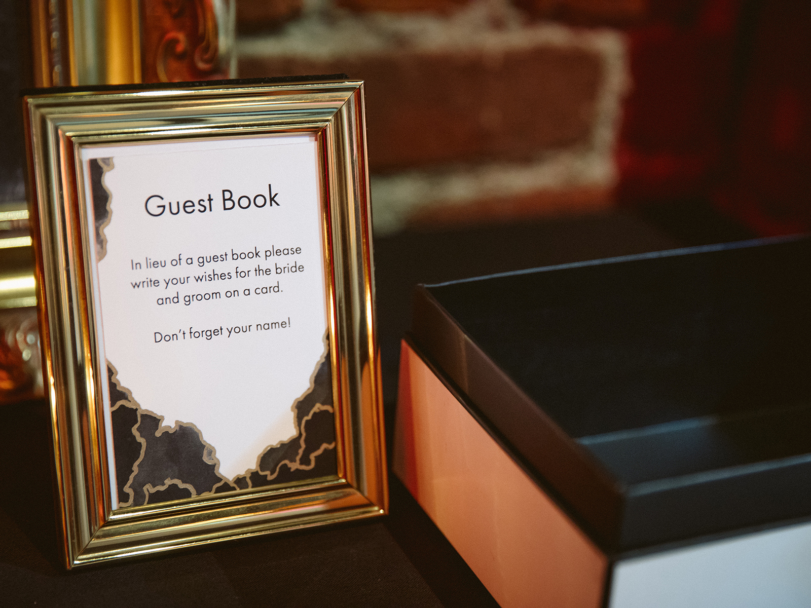
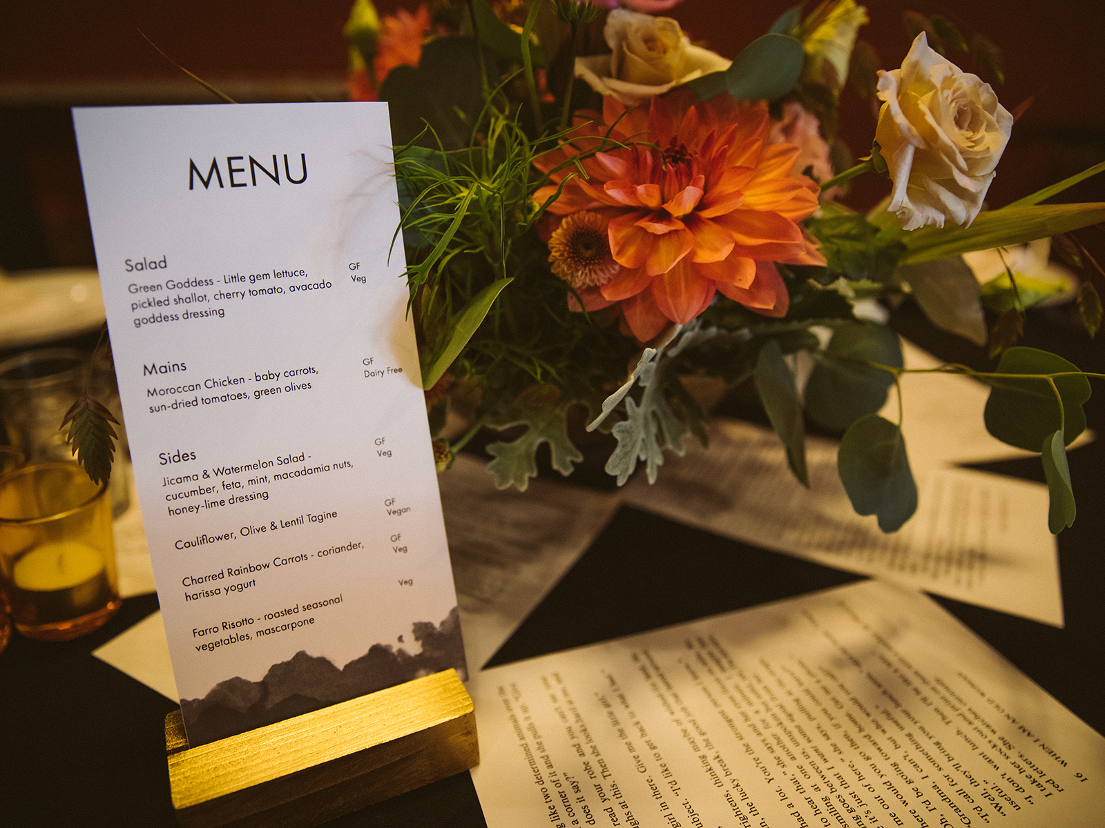
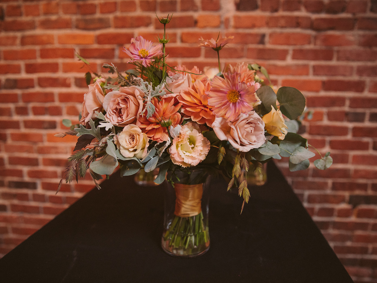
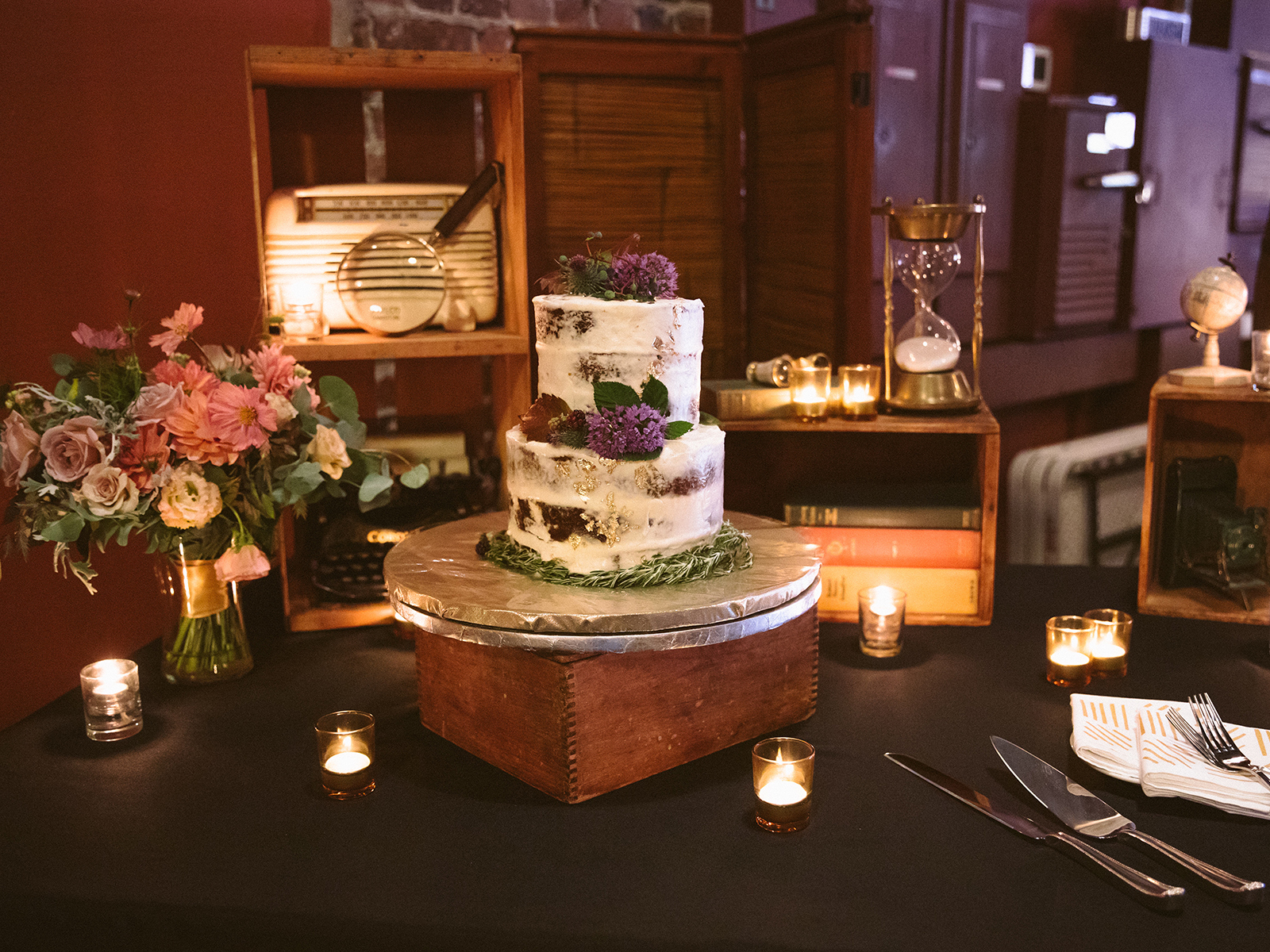
Lake Crescent Wedding
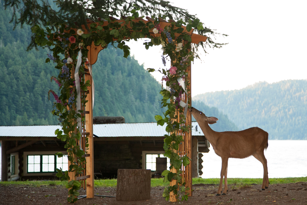
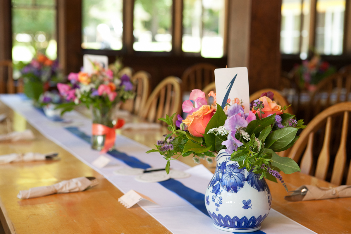
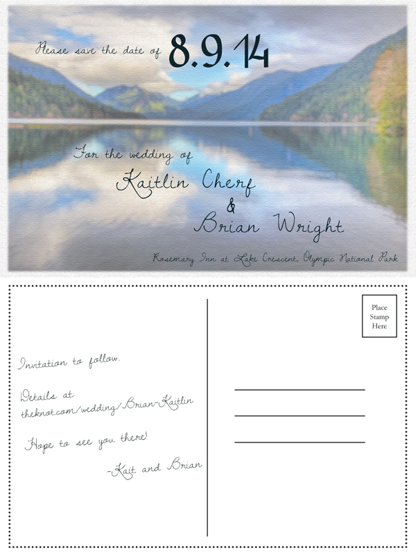

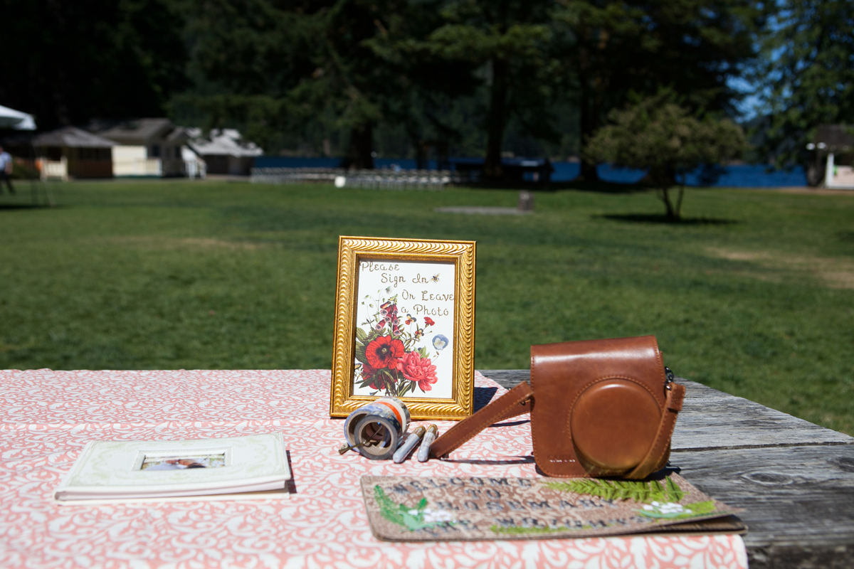
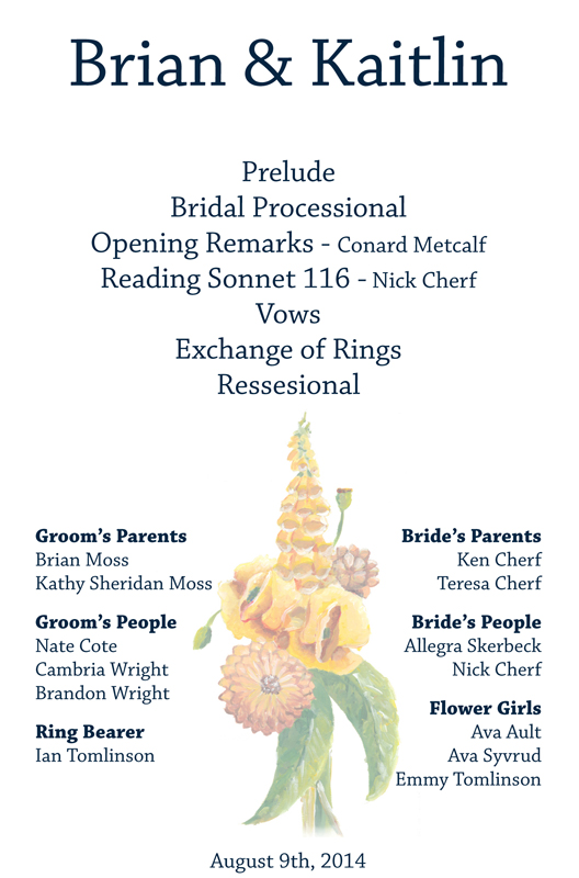
The bride and groom are avid outdoors people, and their top priority was getting married in beautiful natural surroundings. It was important to them that the décor was not overly formal. The bride also has a passion for whimsical antiques and all things vintage. Using an unrestricted palate for the flowers gave the decorations an unstudied look. Navy, peach and coral were used in other elements of the design to create continuity between various aspects of the wedding. As many items as possible were handmade to add to the casual feel.
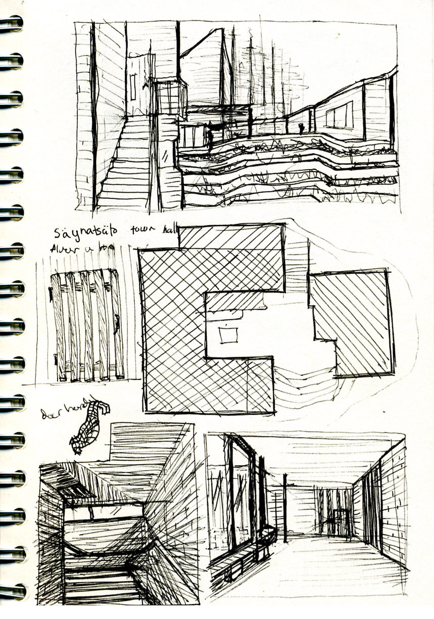
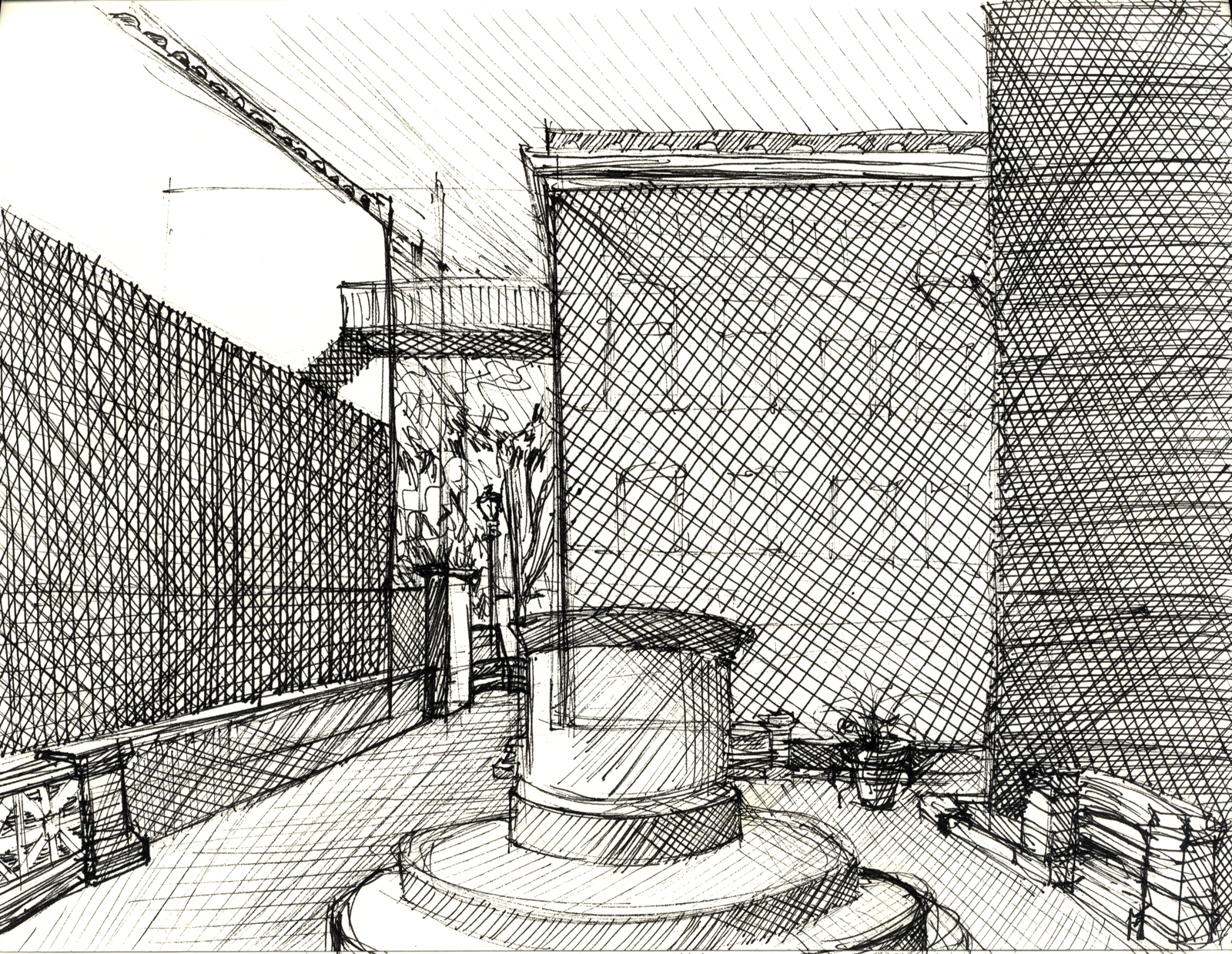
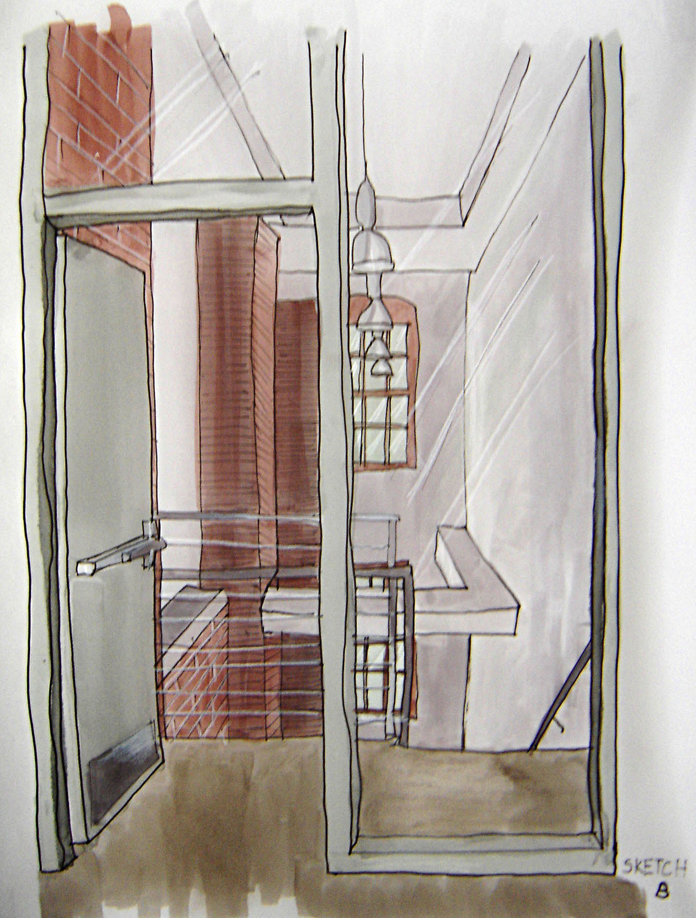
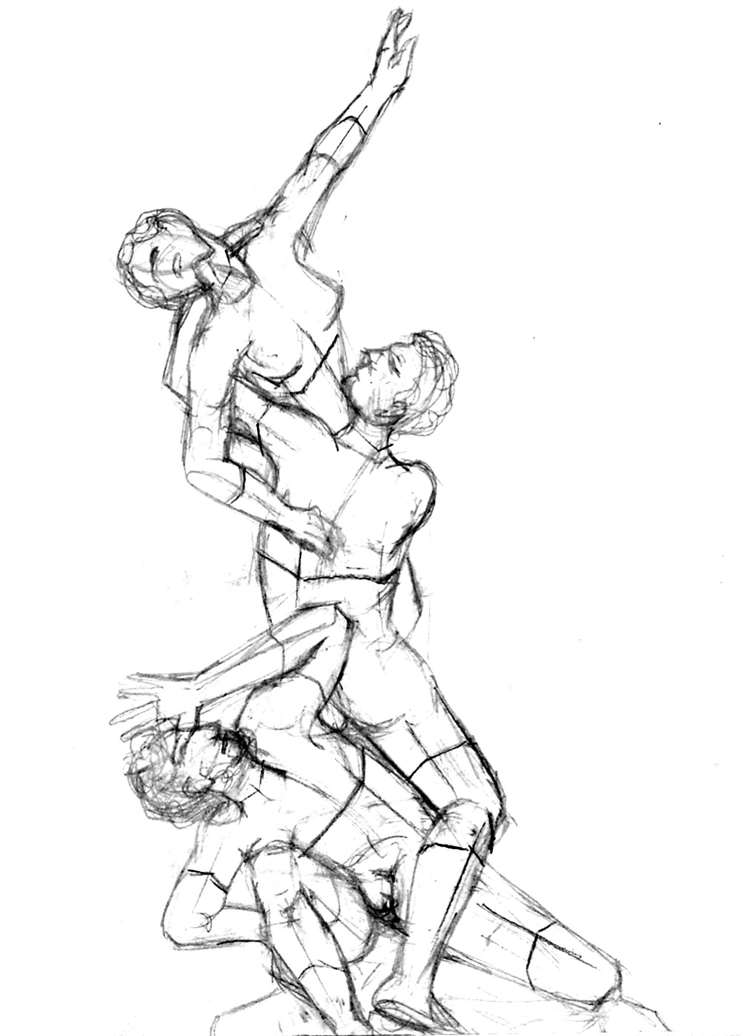
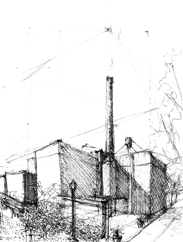
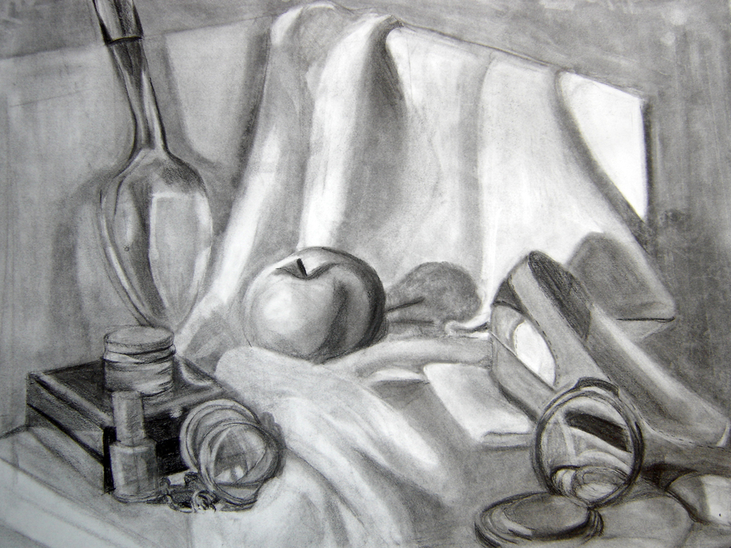
Sketches


Student Work
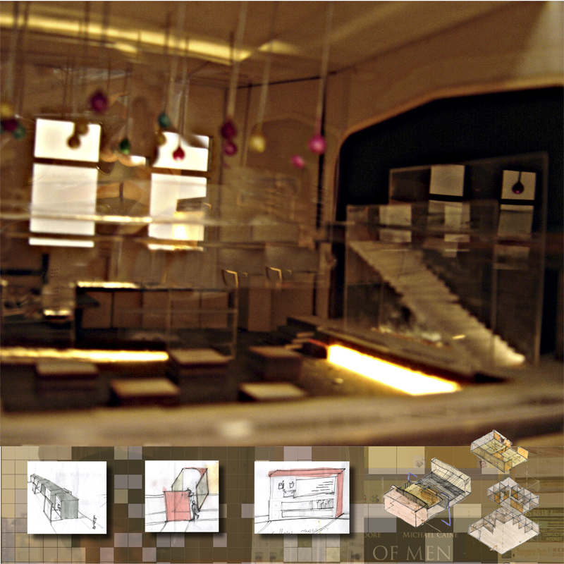
Louis Ghost Exibition Space
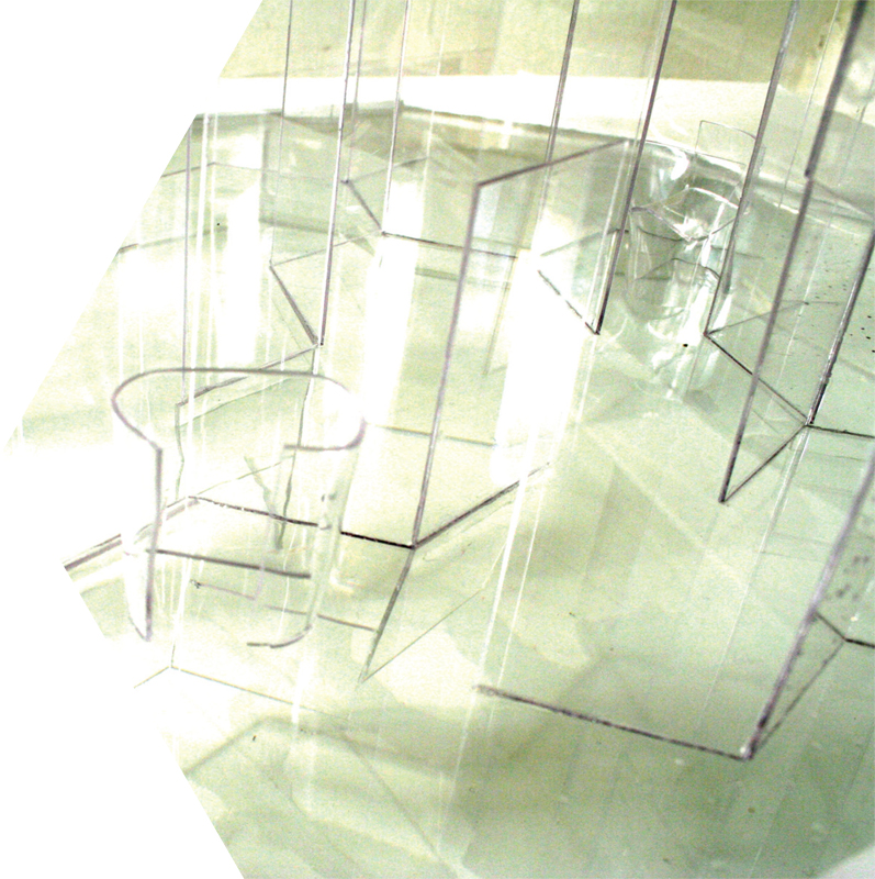
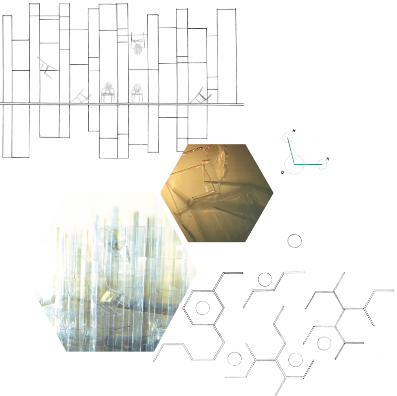
This project involved designing an exhibition space for a notable chair in the history of furniture design. Louis Ghost chair by Philipe Stark was selected because of its interesting shadows and the way its shape distorted light that passed through it. The effect is reminiscent of light passing through water. The plan of the exhibit used the V shaped of a water molecule as a module to create a hexagonal grid. The grid is extruded above the floor plane to create a maze-like space in which the chairs are displayed - and below the floor plane into a pool of water. This combination surrounds the viewer in the same quality of light the chair offers, and gives the chairs a ghostly appearance as their curved shadows are the only thing that differentiates them from the environment.
Copenhgen Bike Shop and Cafe
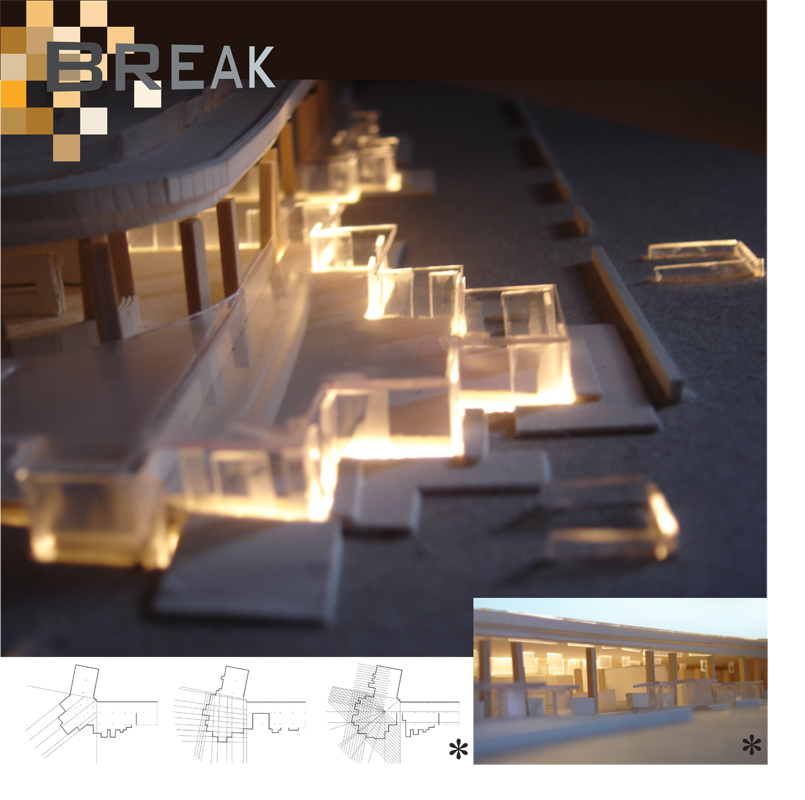
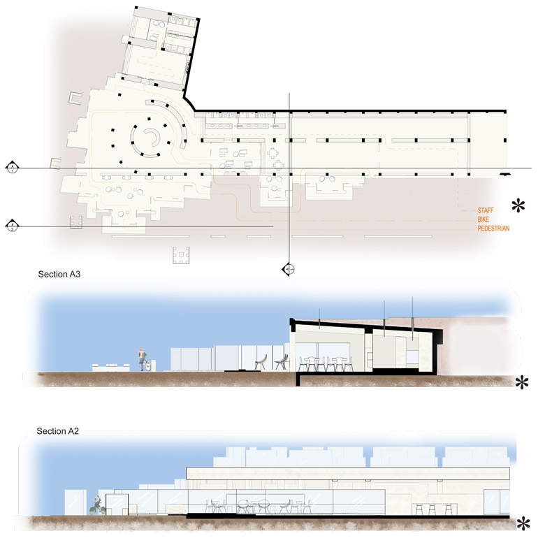
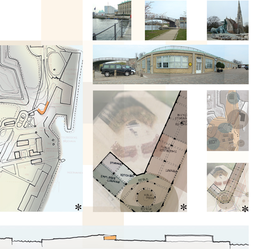
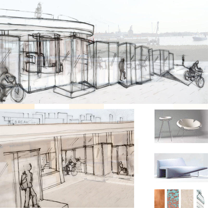
Break Bike Shop and Cafe was a collaborative project; the images produced in concert with other group members are denoted with asterisks. The site sits along the historic Copenhagen waterfront. The concept of disintegration was taken from the way the stone and copper of the buildings were aging. The idea of the design is to have small curb-height constructs on the outer edge of the property where users who are stopping to pick up to-go orders can pause without getting off their bikes. Towards the interior of the space those constructions gradually convert into seating and counter height tables to encourage longer stays.
COP Climate Conference
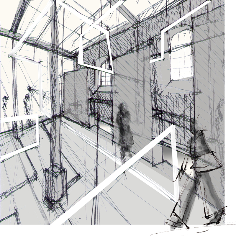
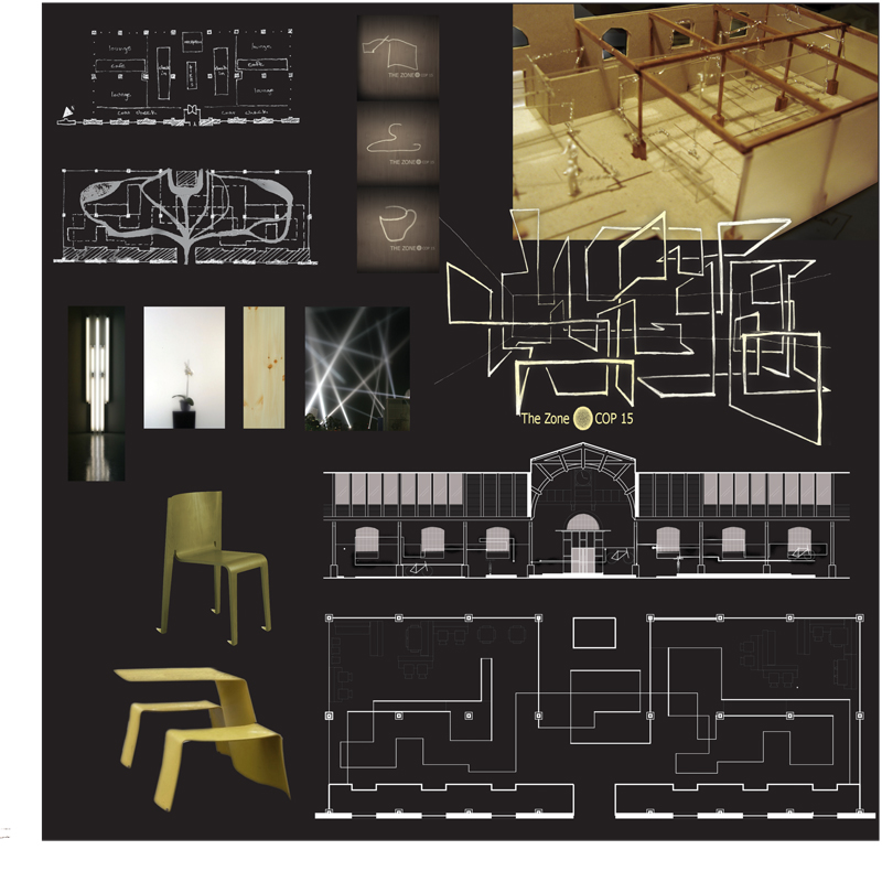
This project is an exhibition space designed for the 2009 COP Climate Conference in Copenhagen. The site is an old stockyard called Oxenhallen. At the time, one of the big efforts to reduce CO2 emissions was to transition away from incandescent lights to more energy efficient fluorescents. The design uses fluorescents to create a continuous linear element that divides the space, framing glass panels where necessary. Signage and way finding is projected onto the floor with stenciled down lights.
Dior Pop-Up
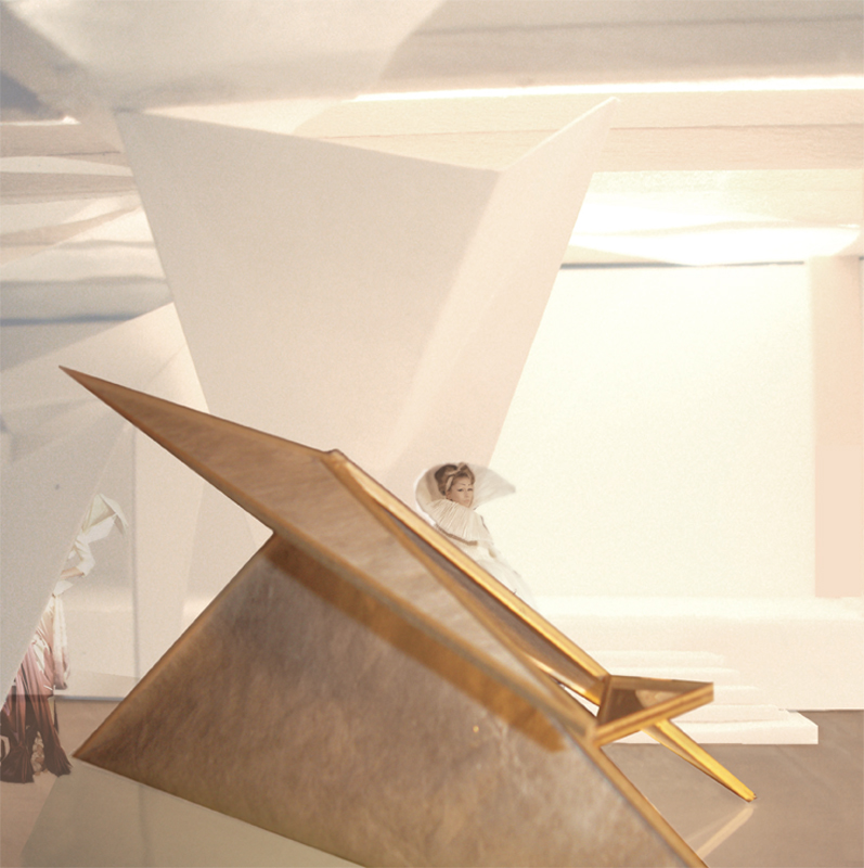
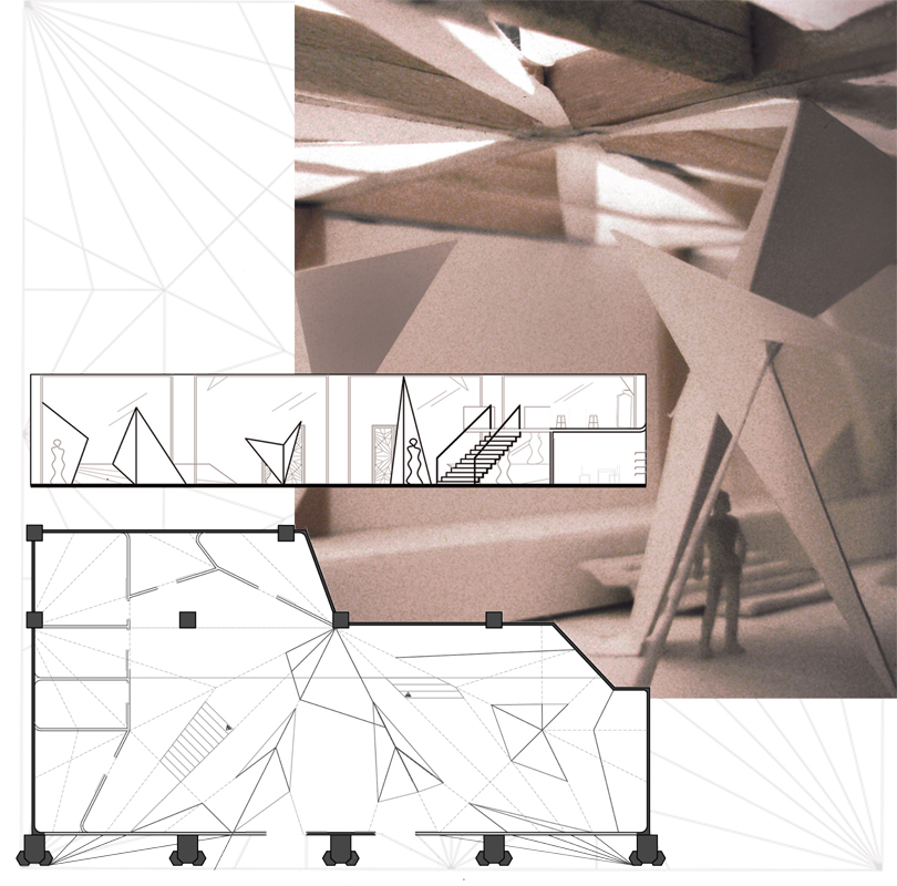
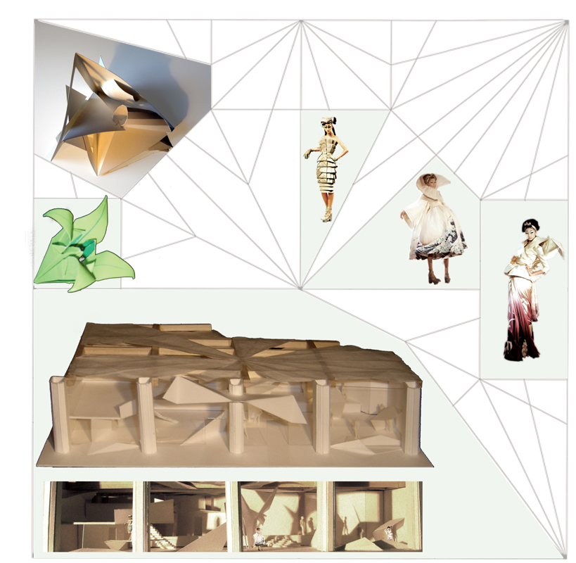
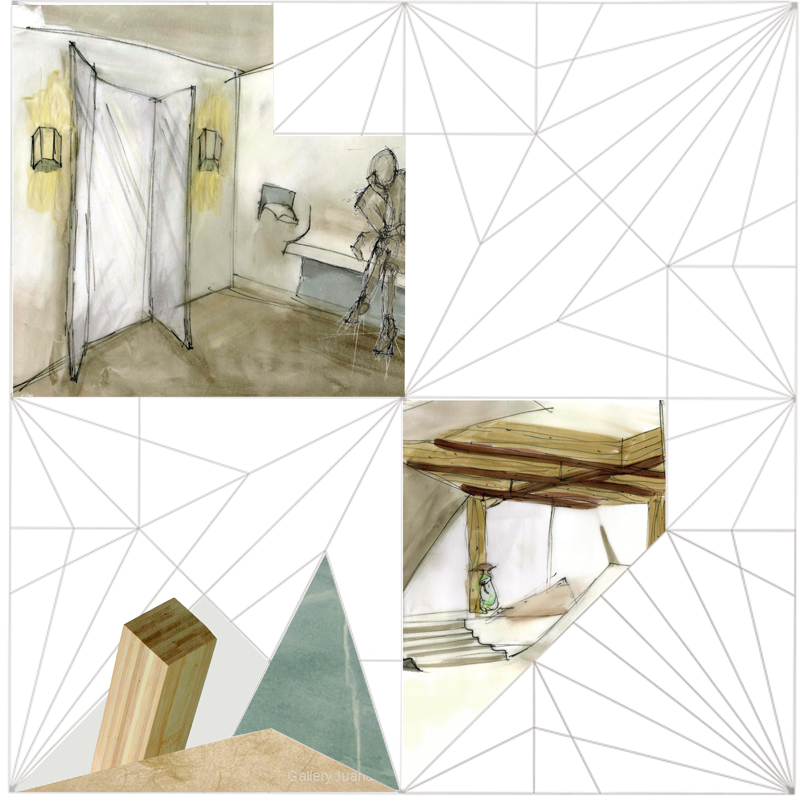
This pop-up shop is designed around the Dior Couture spring 2007 collection, which was heavily inspired by origami. The floor plan is based on a unfolded origami flower. To minimize the waste created by disposal of pop-up, the walls and dividers are made of paper or heavy cardboard with wood frames where necessary.
School for Transtion from Homelessness
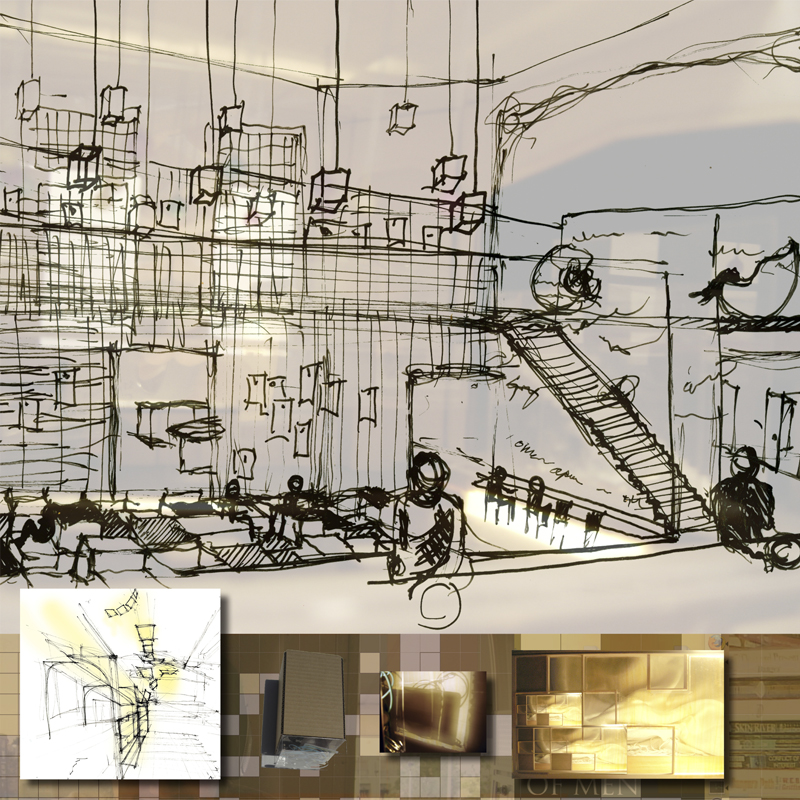
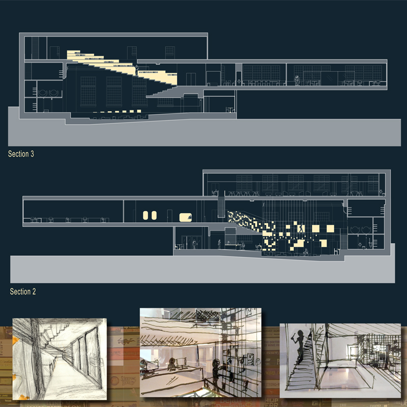
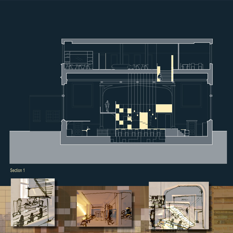
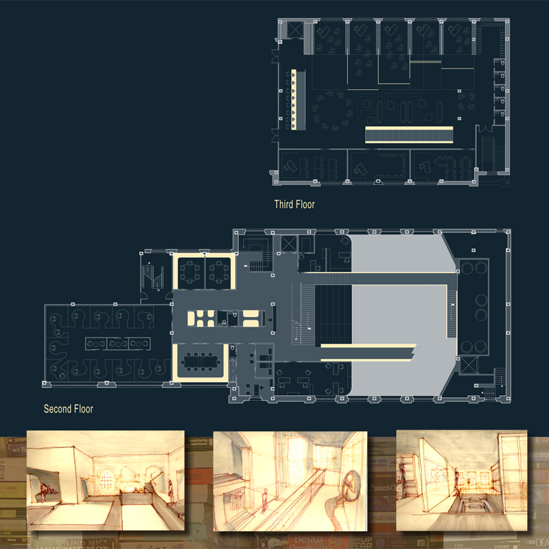
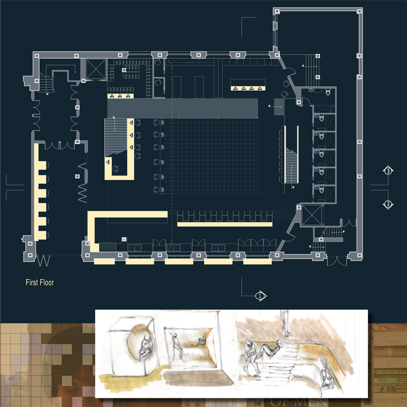
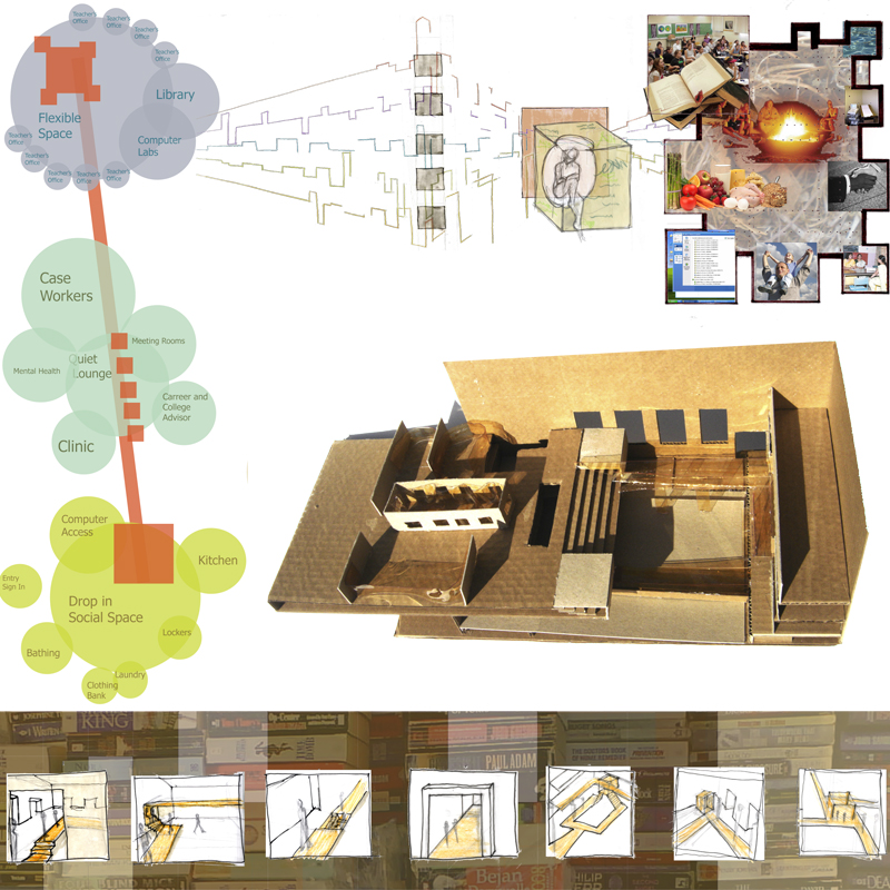
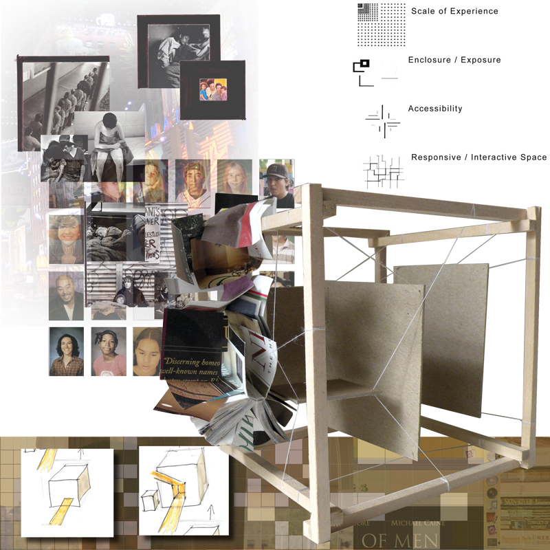
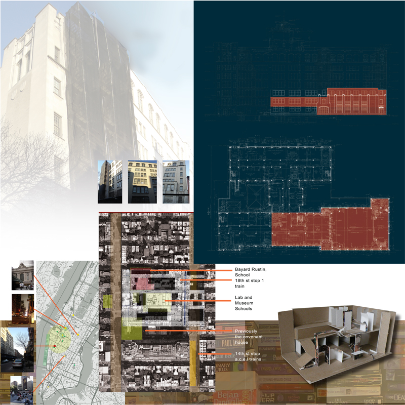
This is a program driven design installed in an auditorium and a few classrooms of a historic Chelsea high school. It is a drop-in service center and school designed for homeless teenagers. The flow of the space is a linear path that climbs vertically as the students become more engaged in the program. Starting with grab-and-go food service windows out to the street, it continues in the auditorium’s open space allowing adequate supervision without a feeling of confinement. Further into the space there are more intimate spaces for privacy, and classrooms.